Exploring identity and collectivity through card games
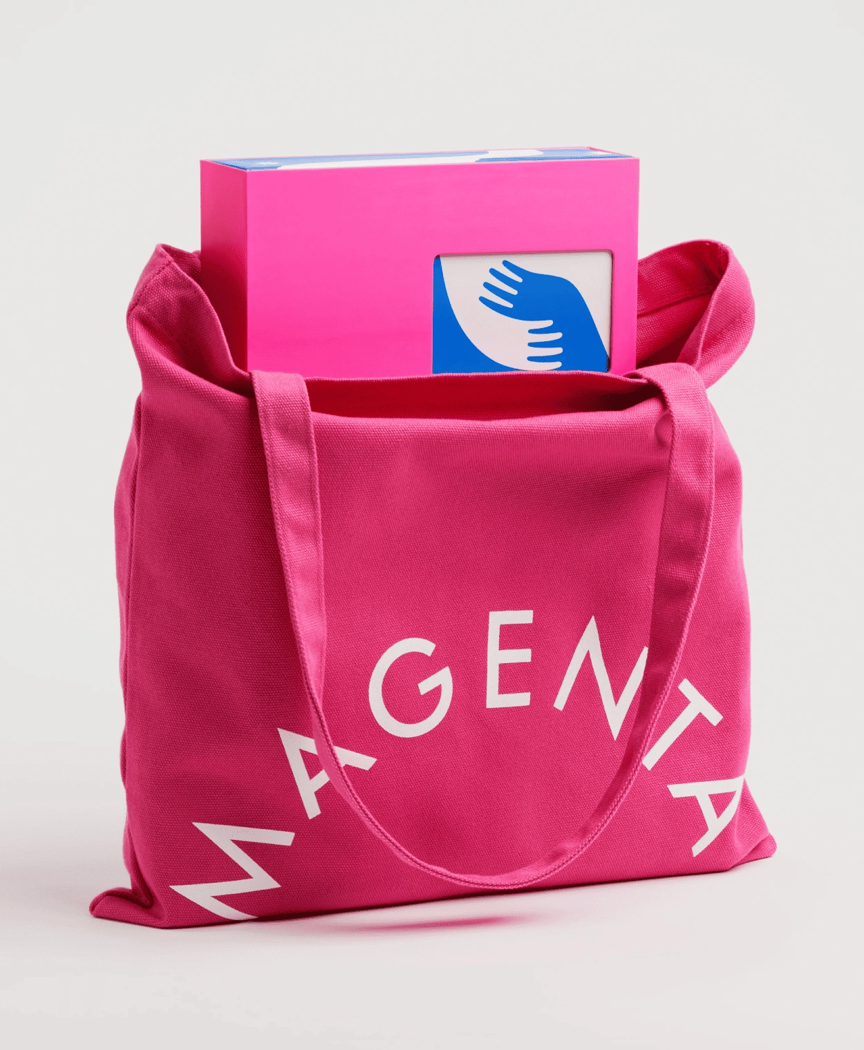
Identity, packaging, and game design for Magenta, a unique card game publisher developed by CMYK. The brief calls for creating a pack system that generates both identity and sense of collection, while allowing the individual expressiveness of each game.
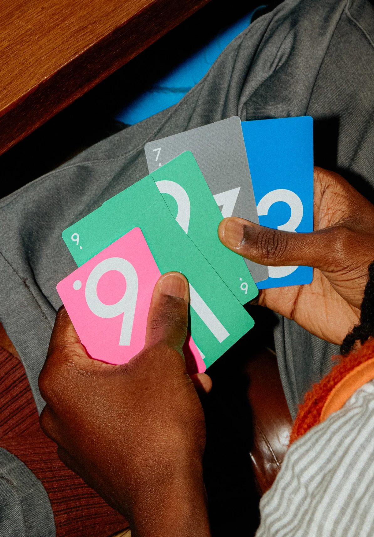
The systems takes the shape of the card as a starting point in order to inform everything: From packaging, to identity and communications elements such as motion and social media.
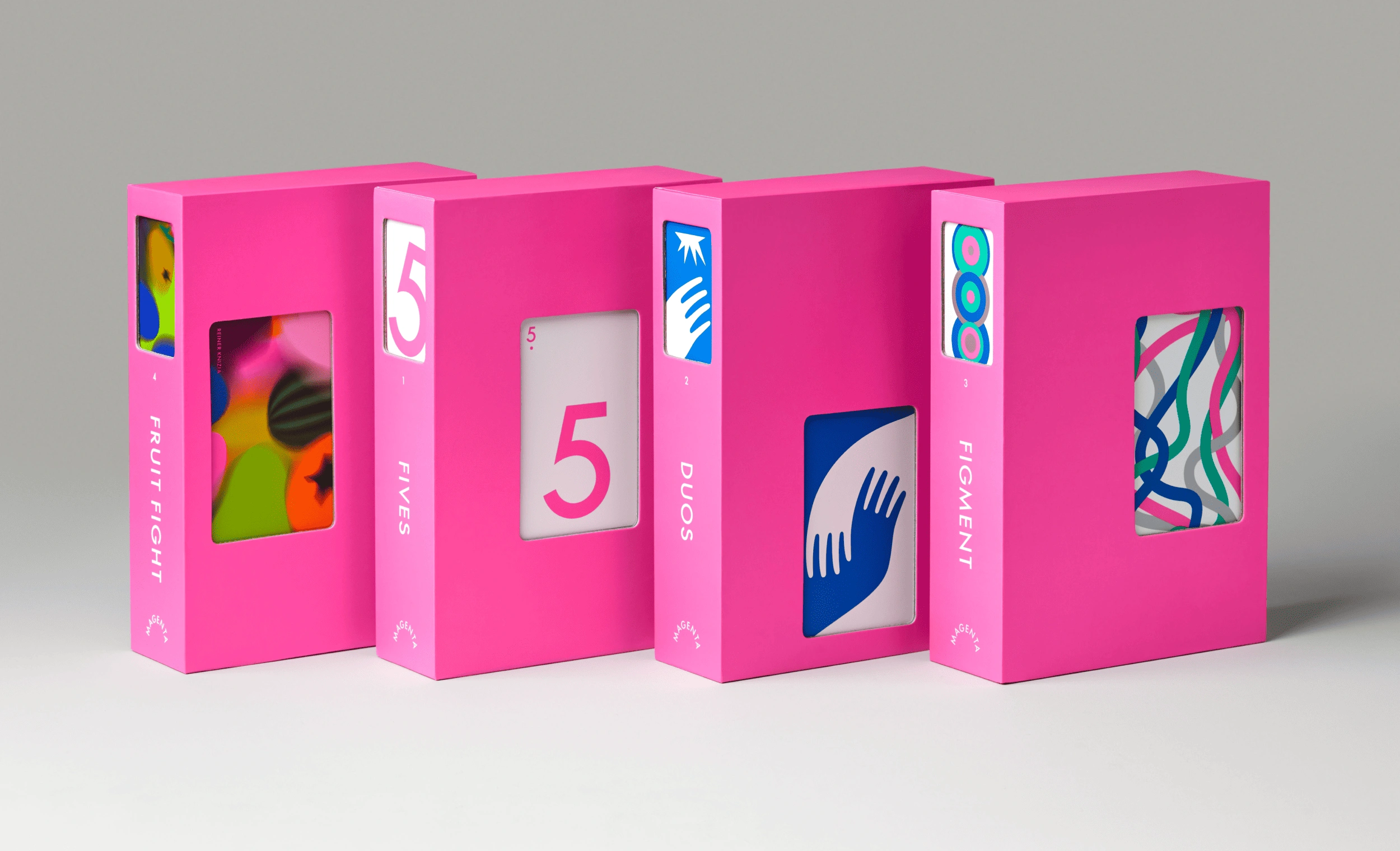
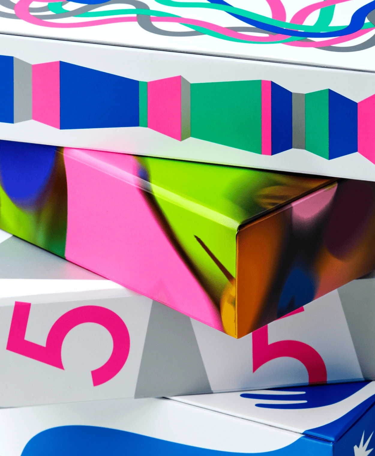
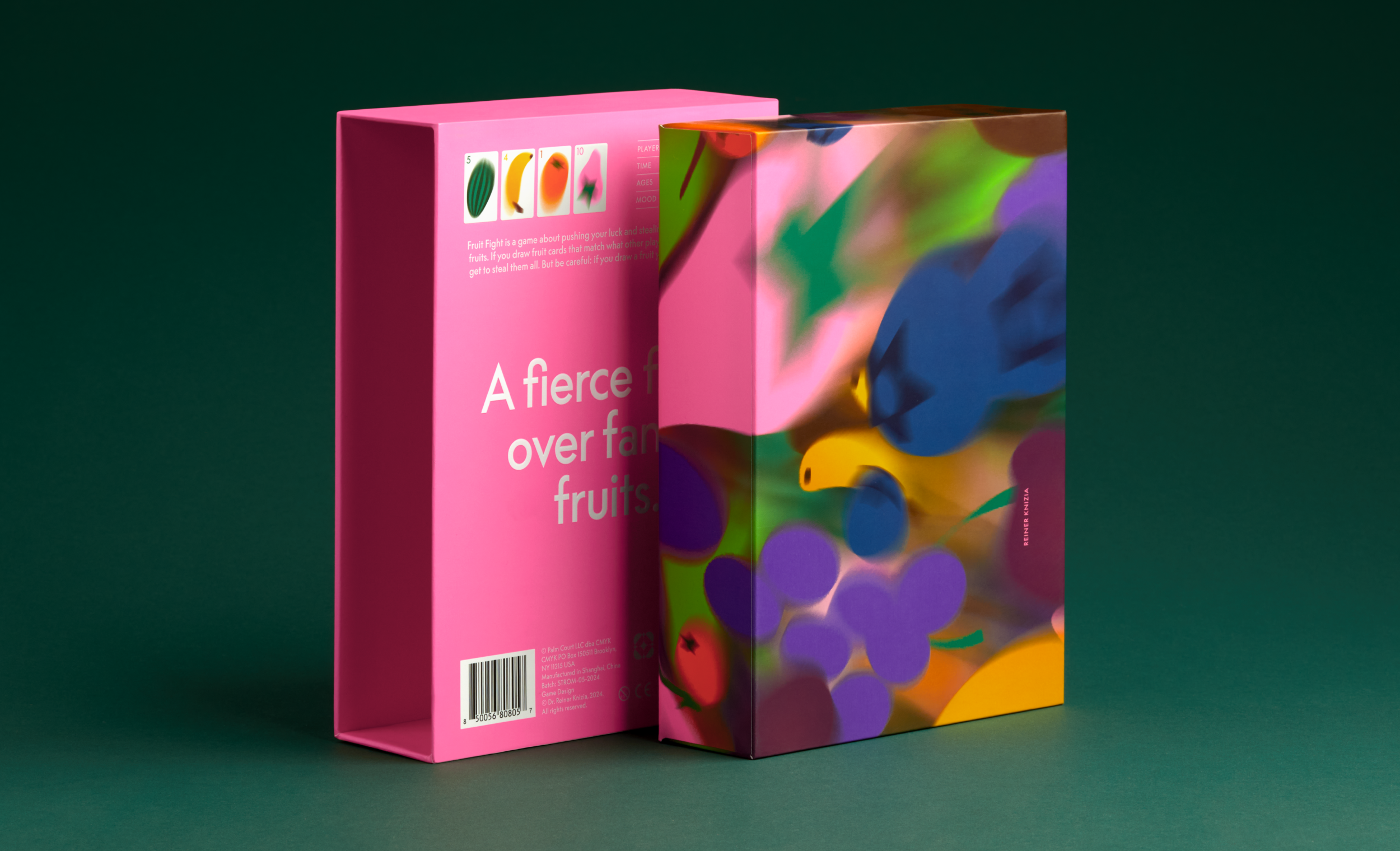
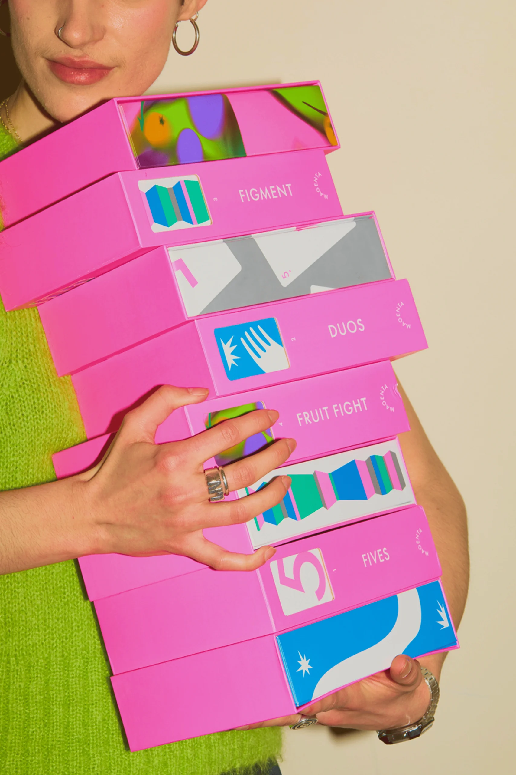
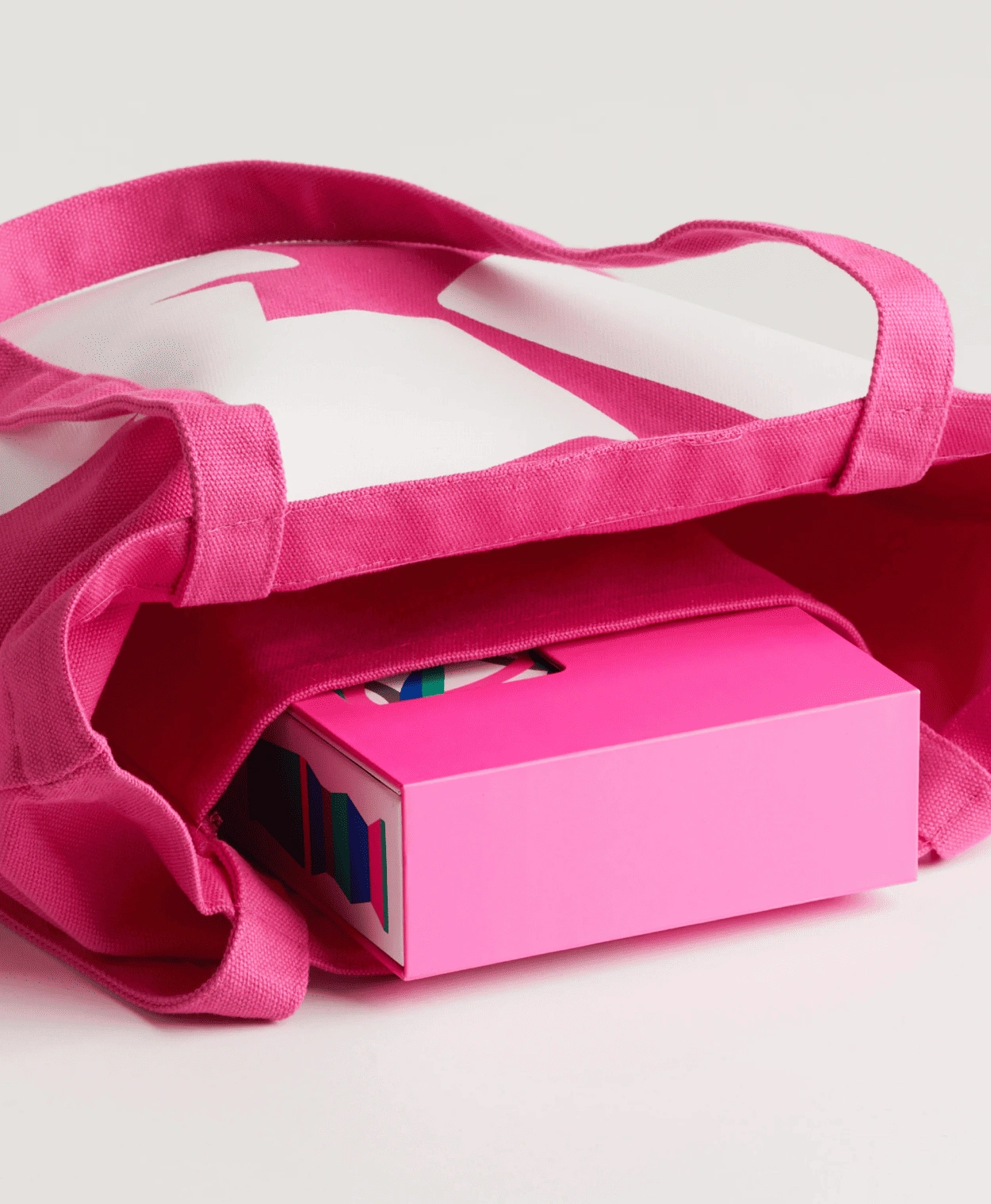
The packaging is divided into two parts: the exterior, which maintains coherence and highlights the collection with a striking shelf presence; and the interior, where the changing expressiveness of each game takes center stage.
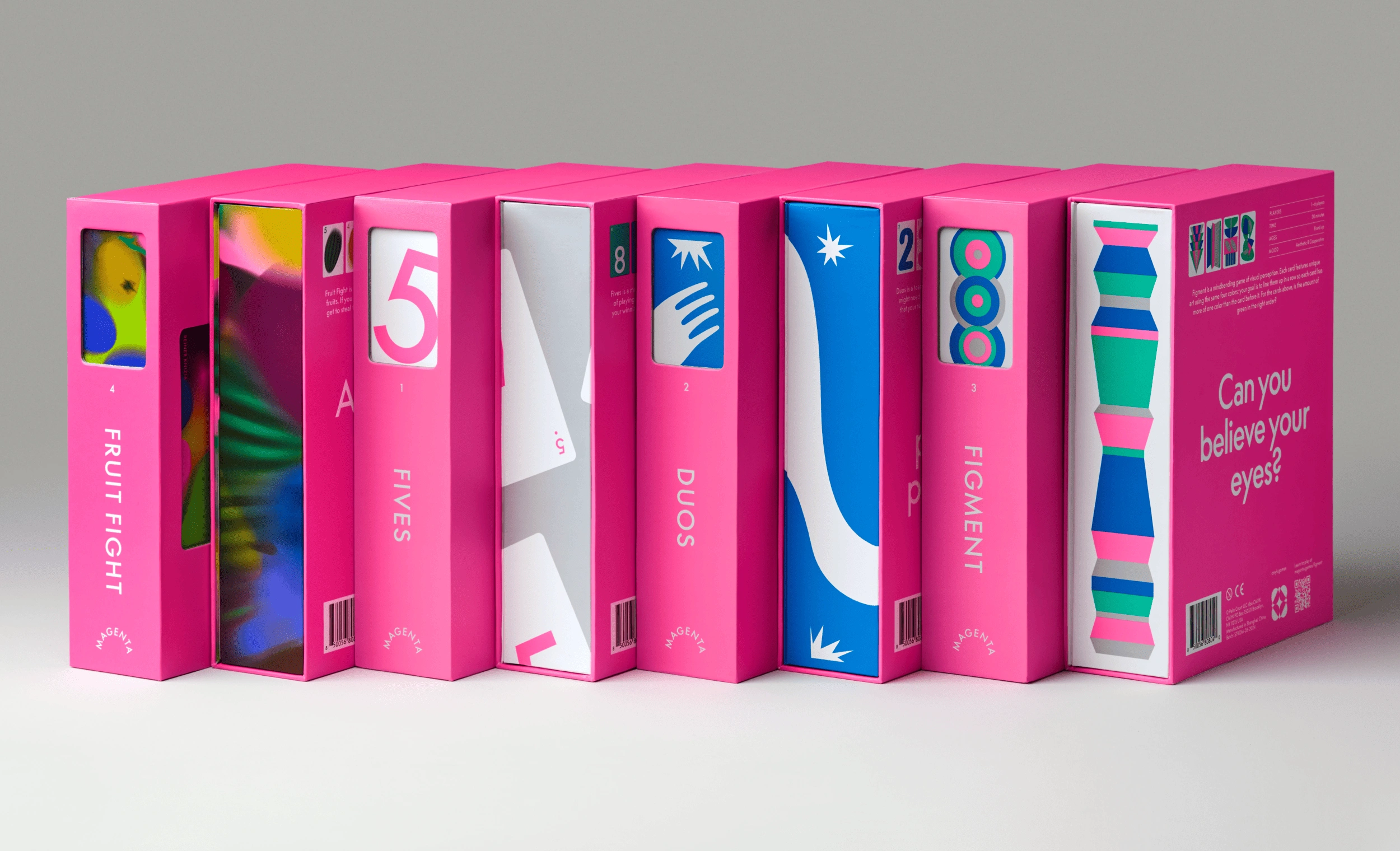
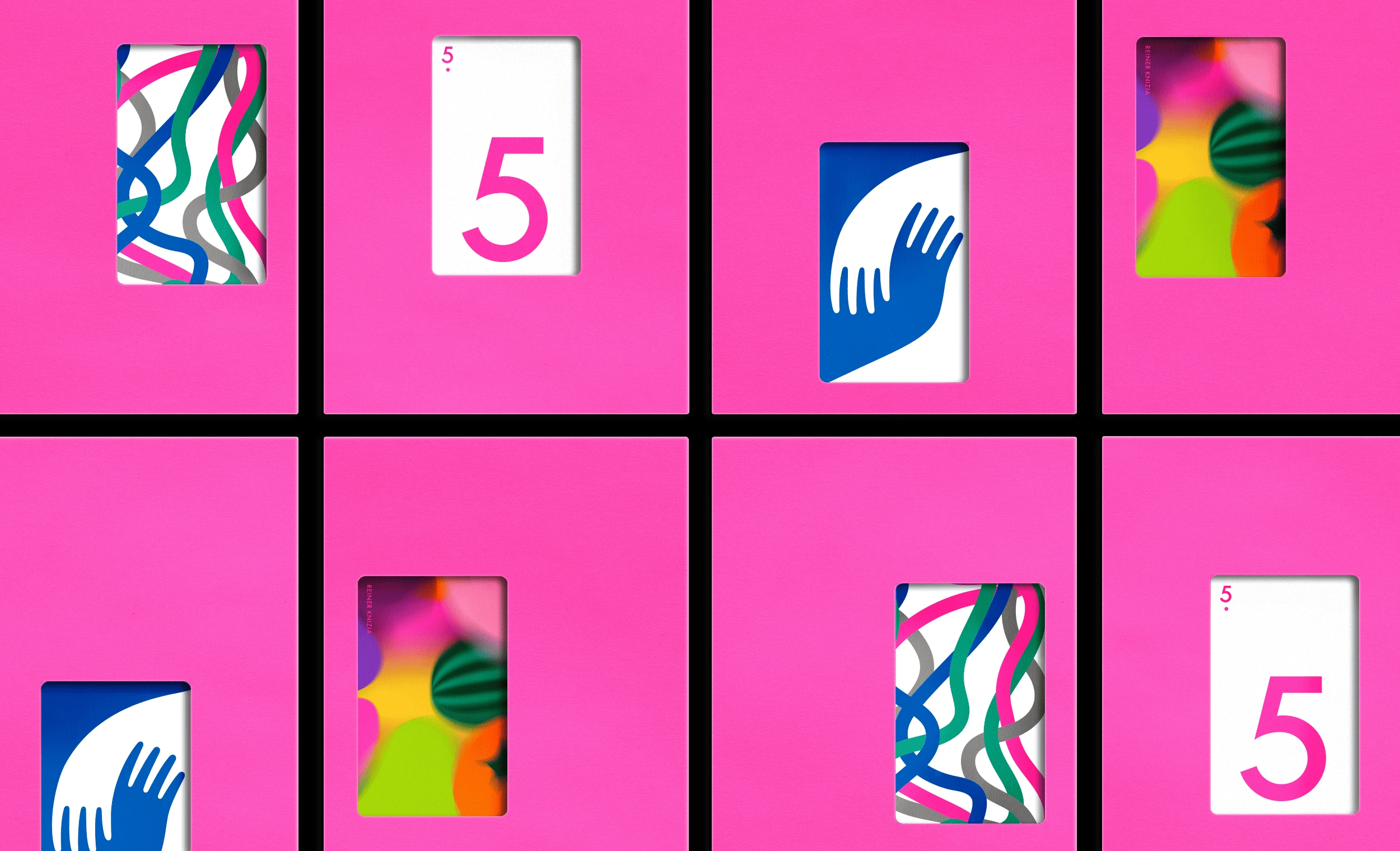
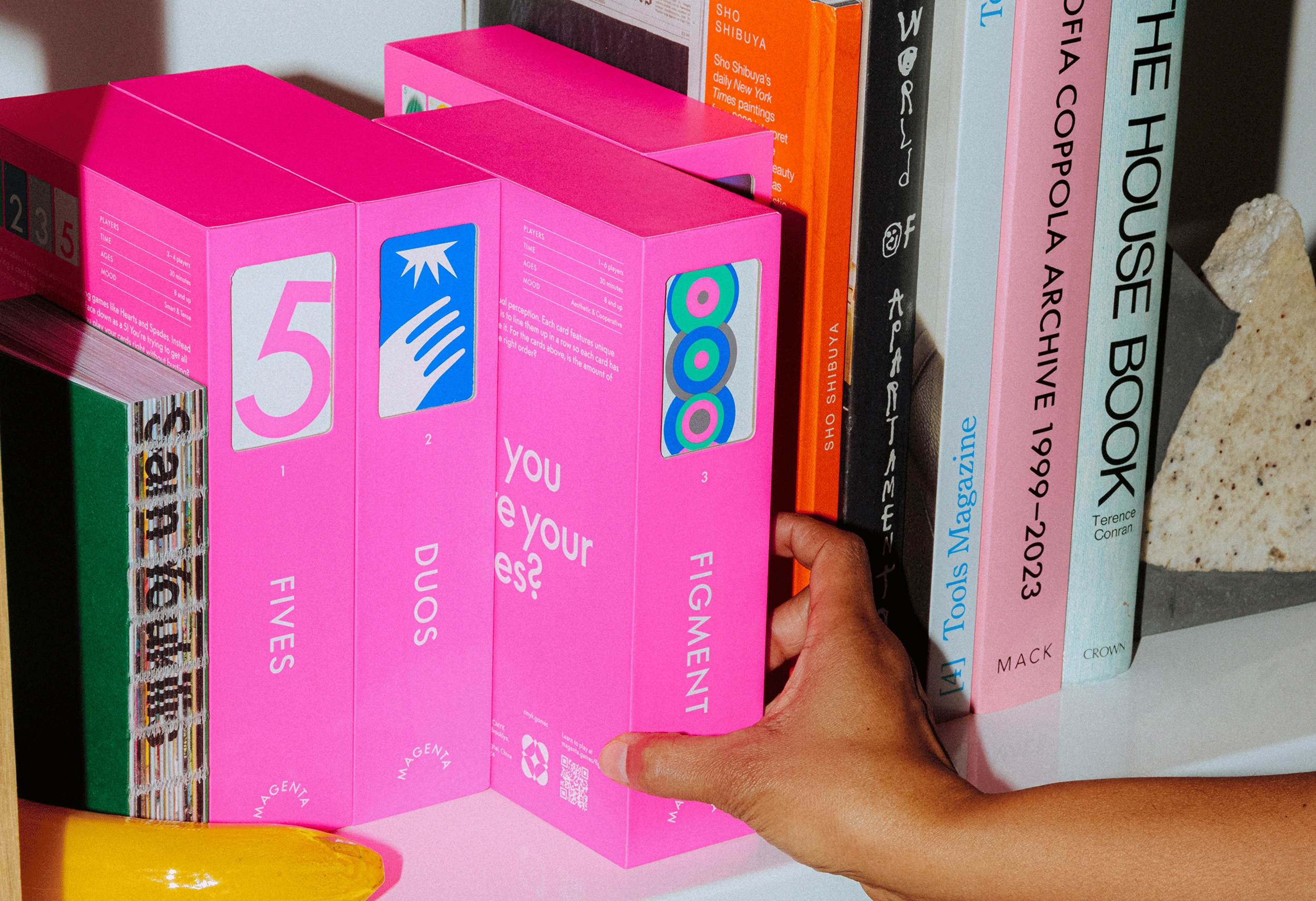
The case design reinforces a consistent identity, while the cover die-cuts allow for various window placements, emphasizing the surprise and fun of revealing an illustration that is unique to each game and also matches the back of the cards.
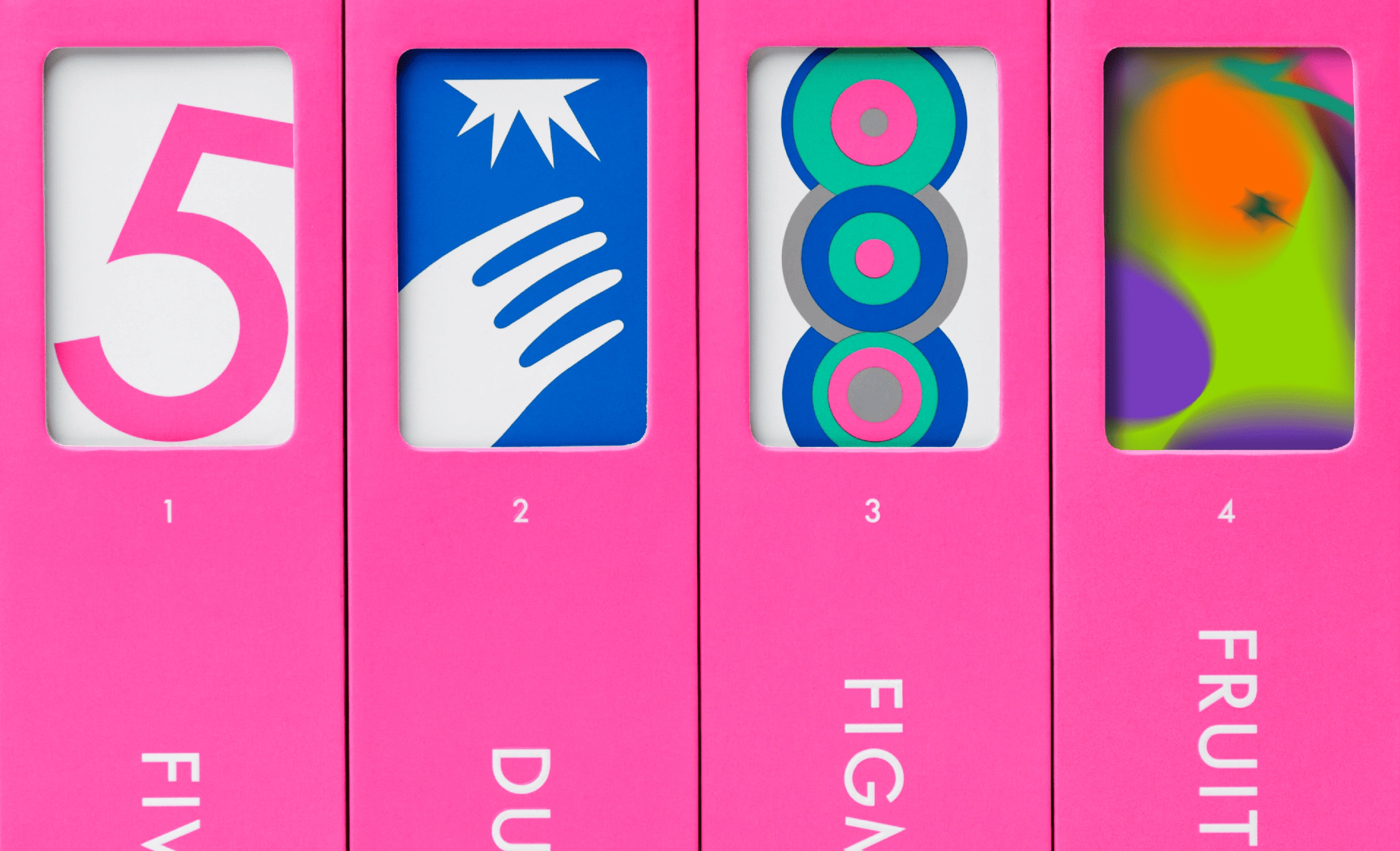
The game spines become an informational display, feeding into this collectable desire while also further reinforcing the brand’s identity.
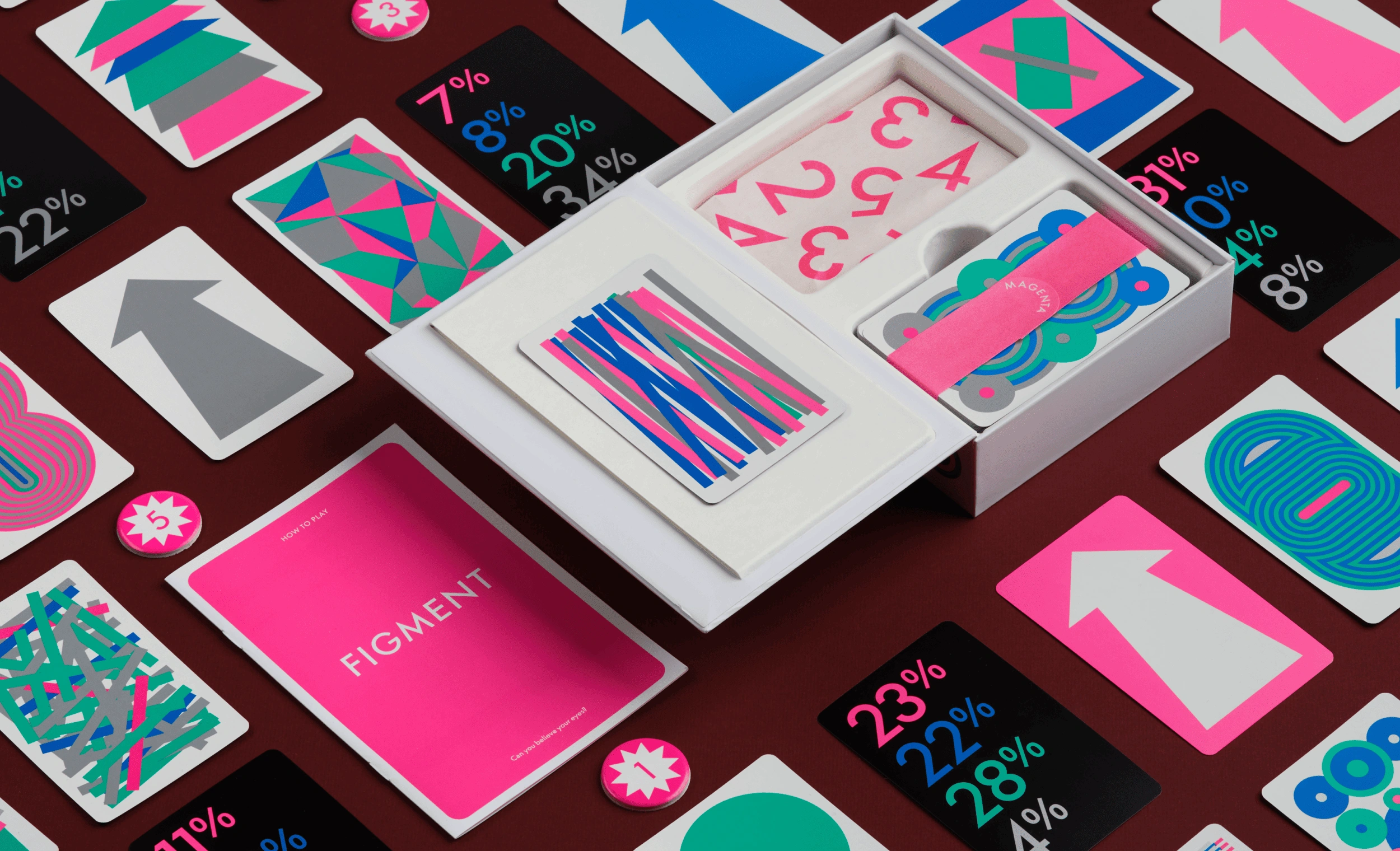
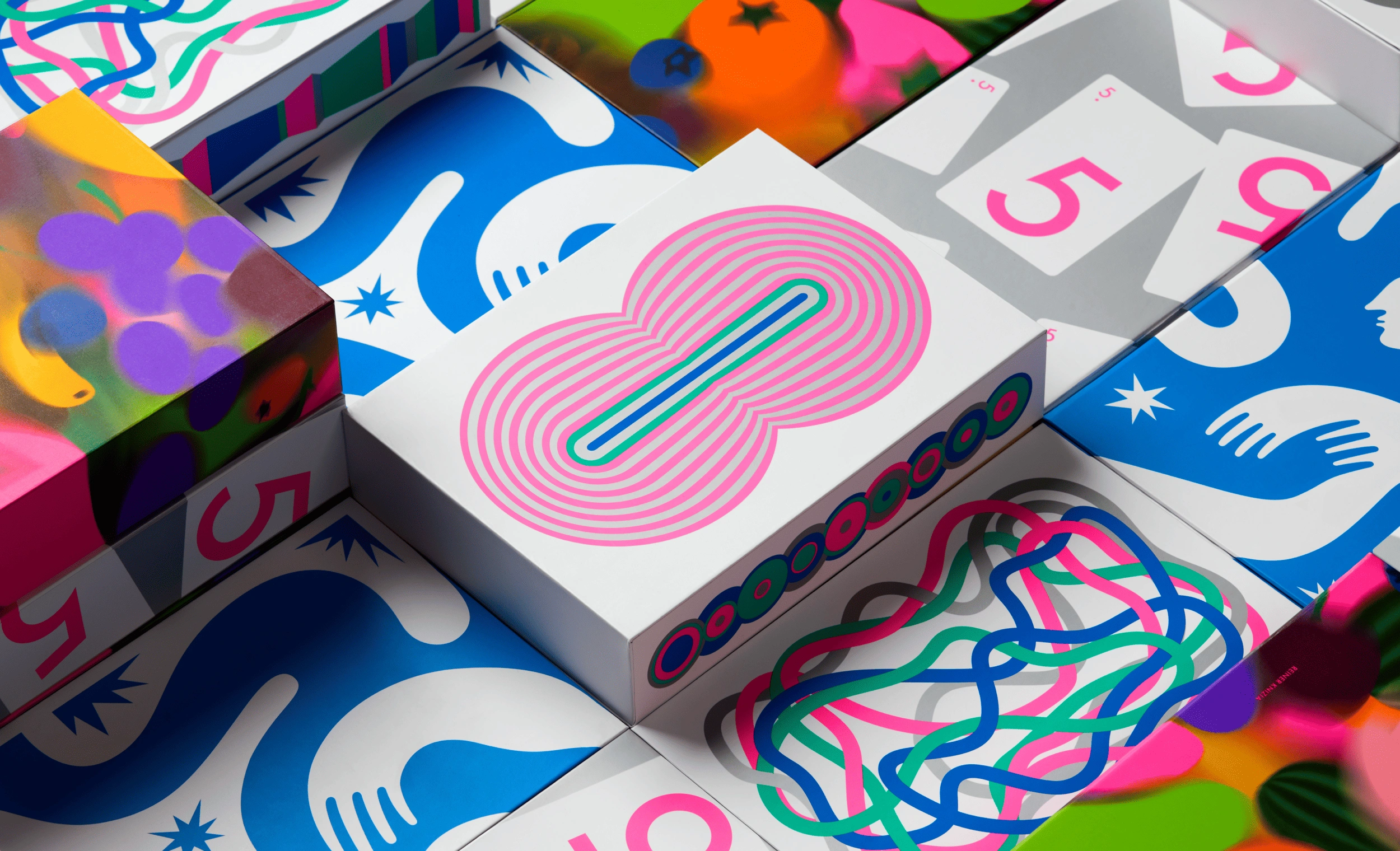
The packaging interior was designed as a bento box, tailored to hold the specific components of each game, with different shapes and sizes.
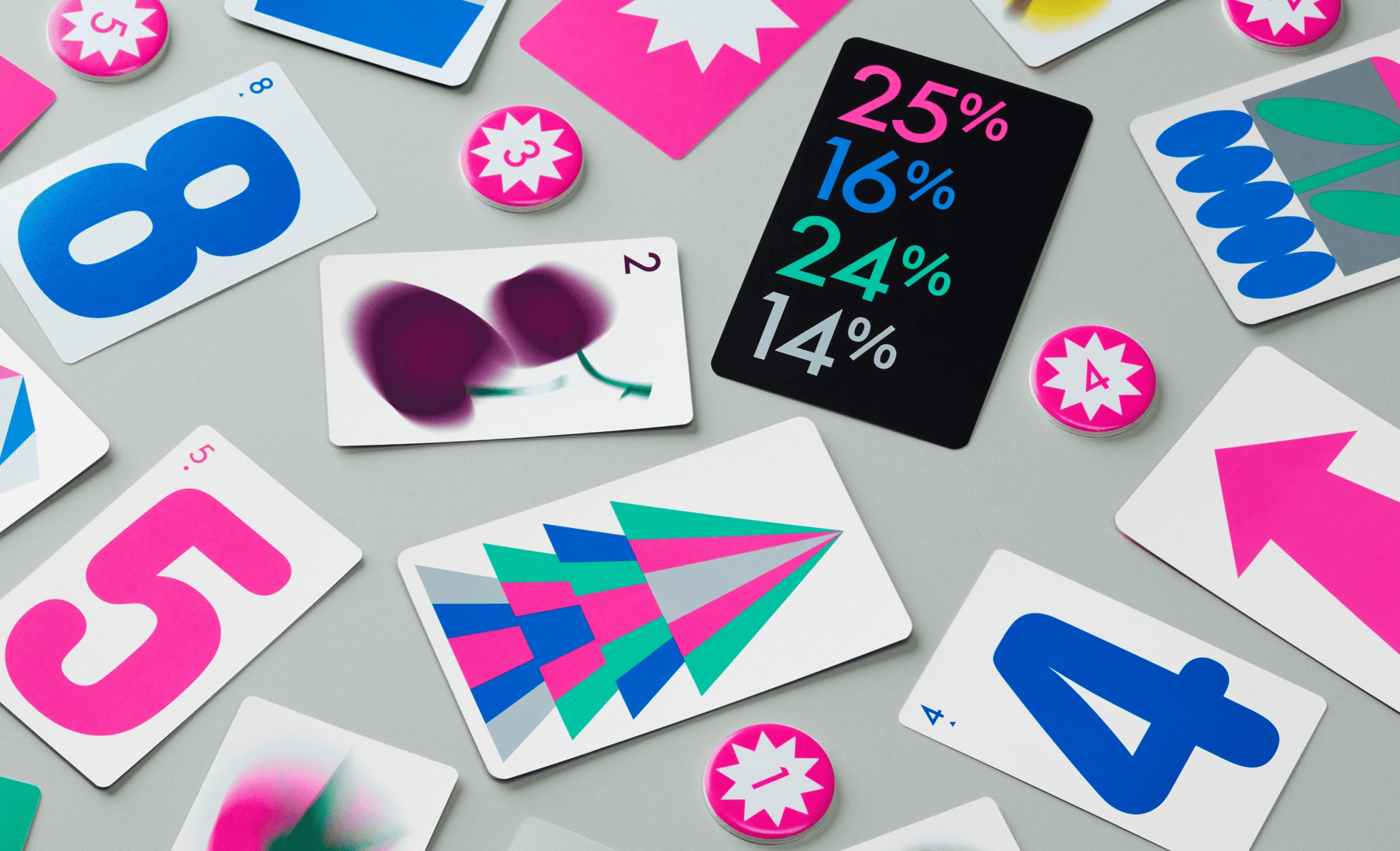
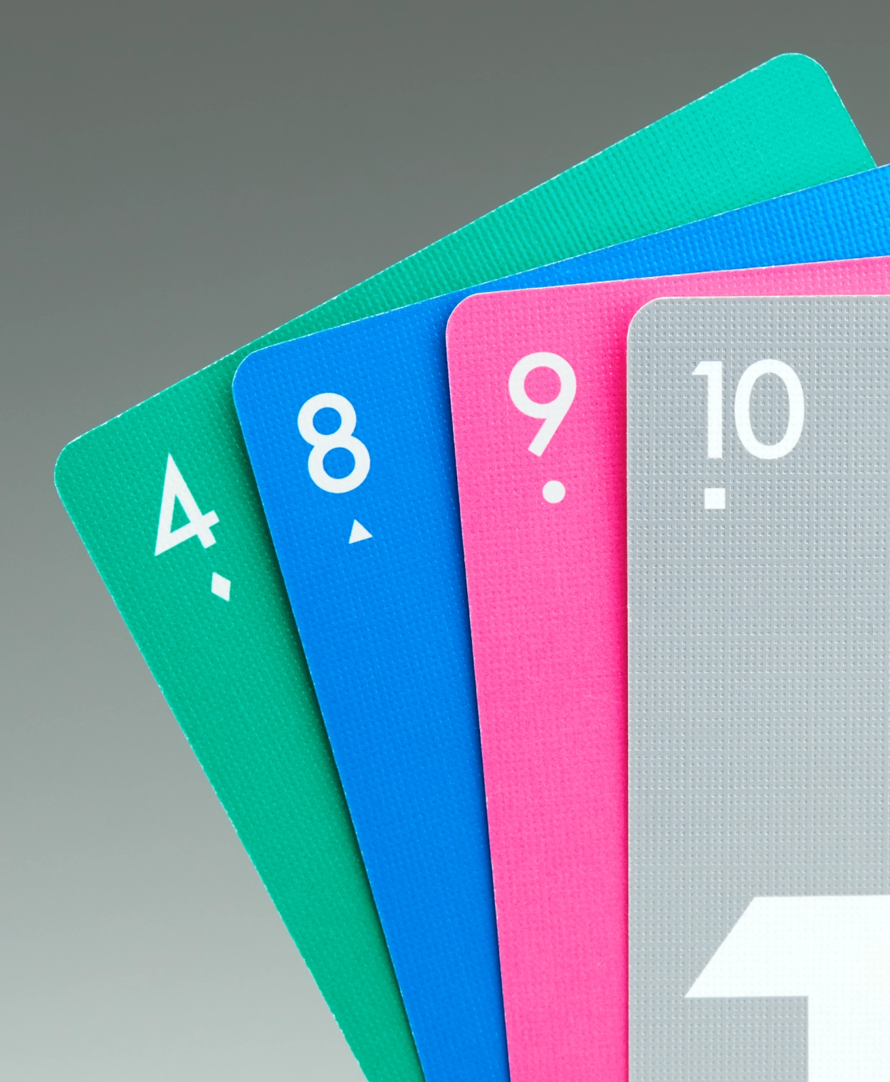
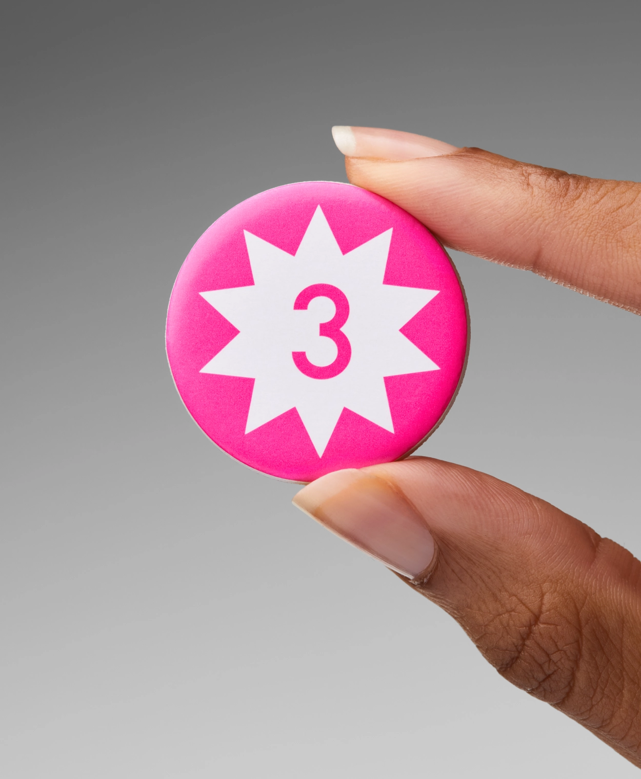
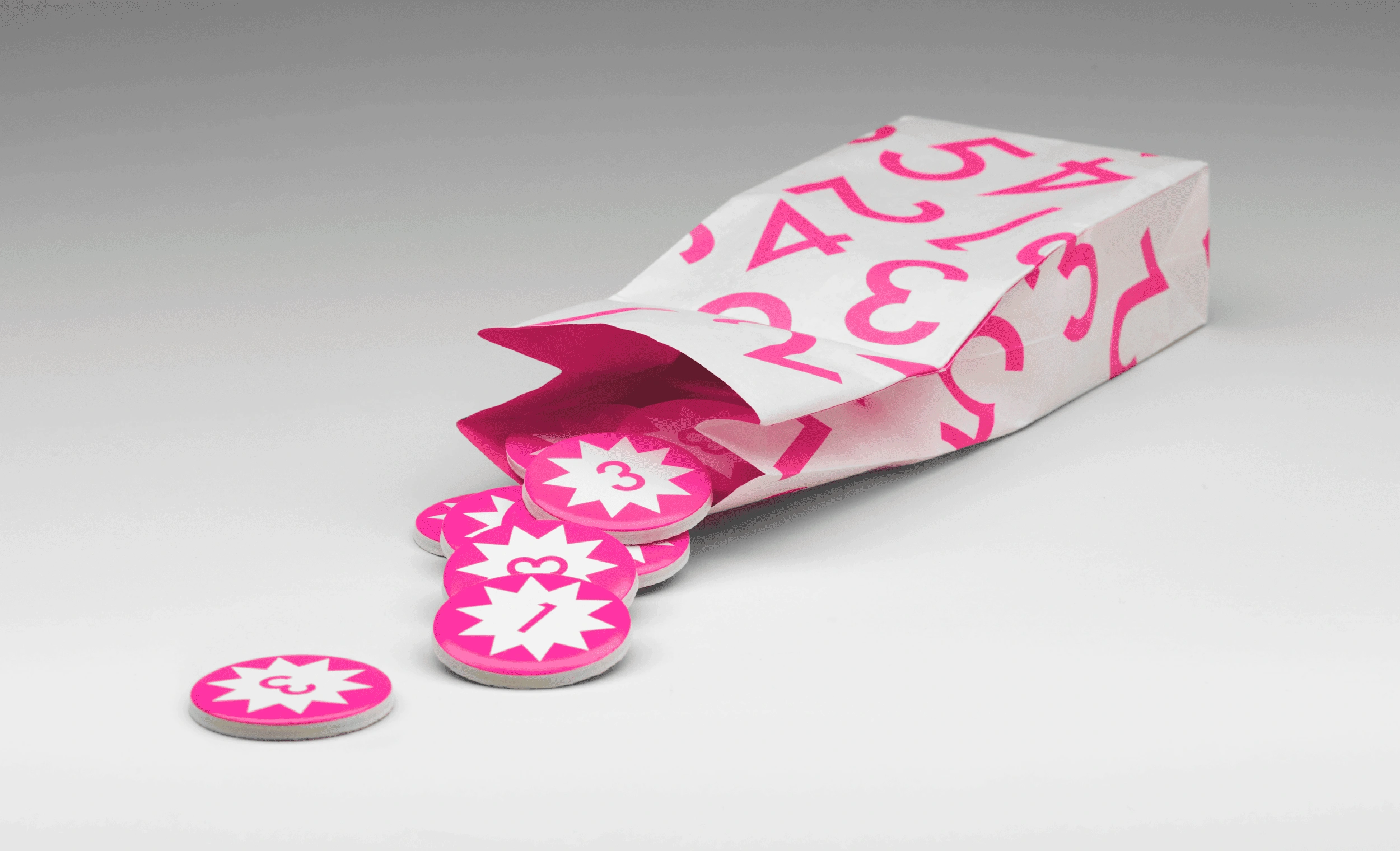
An accessibility system with indexed icons below the numbers has been designed, ensuring that all games are playable for people with color blindness.
Magenta is used boldly and confidently across brand elements, serving as the anchor of our identity. While each Magenta game explores its own unique color universe, the consistent presence of magenta reinforces and unifies the brand.
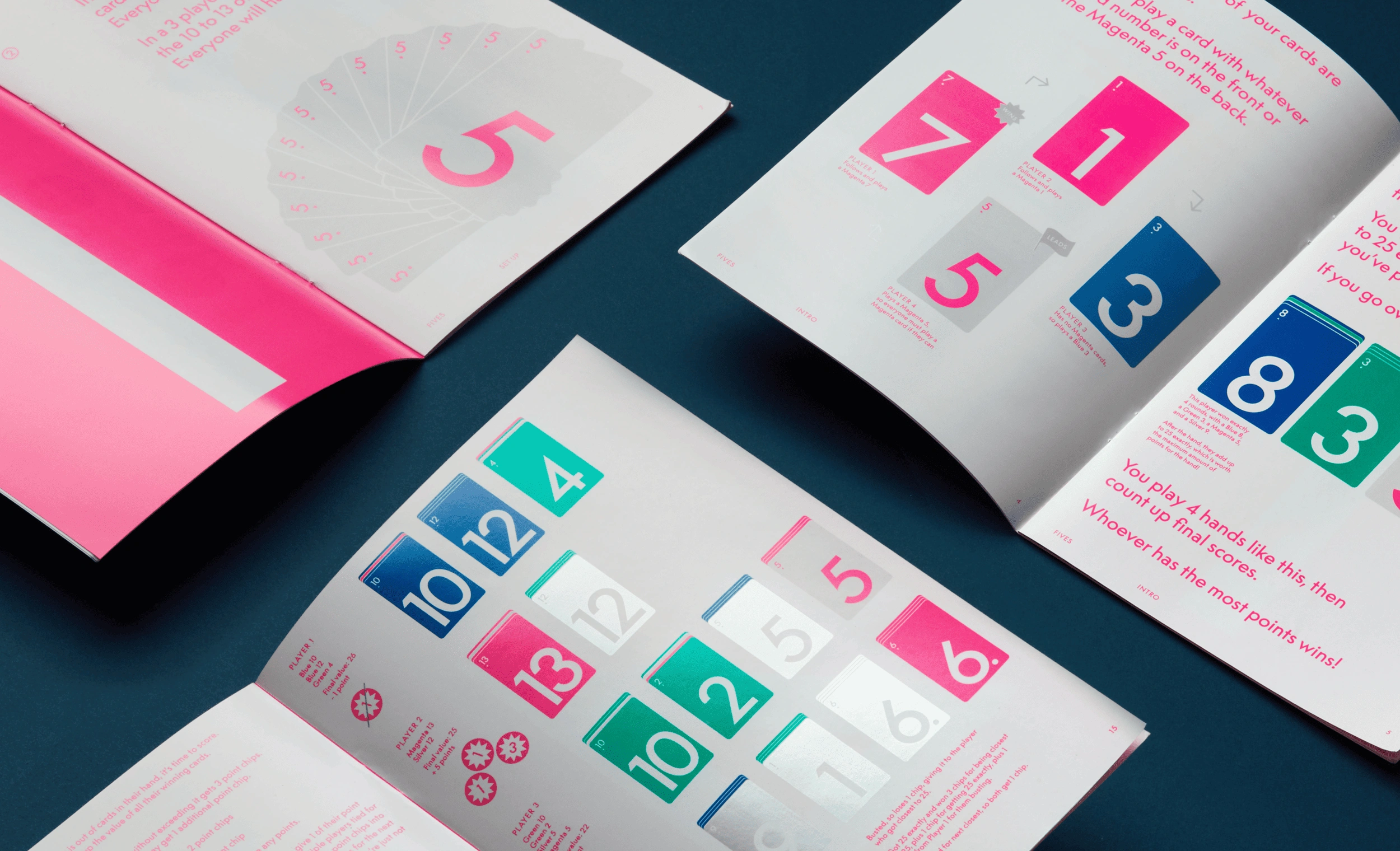
The game instructions have been carefully designed as an editorial piece, with each section organized into clear chapters to enhance readability and make the game easier to understand.
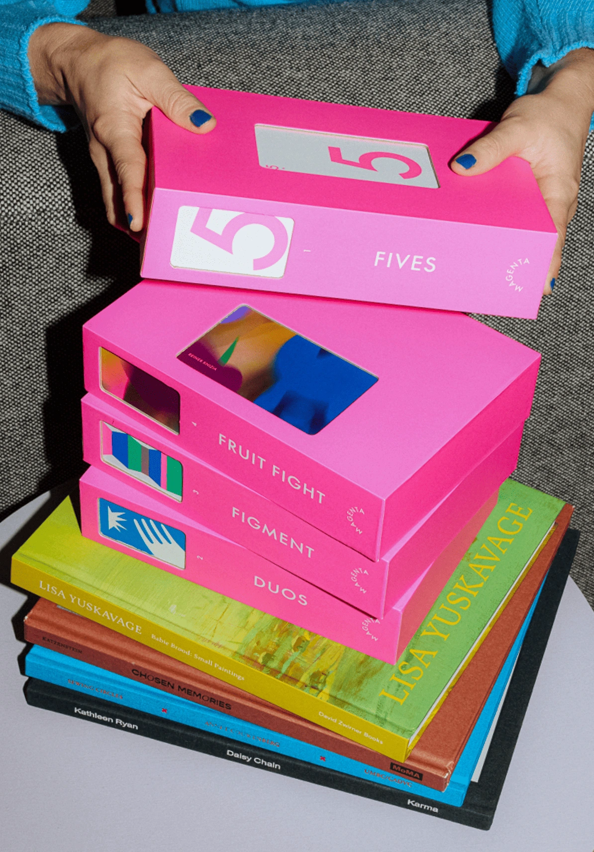
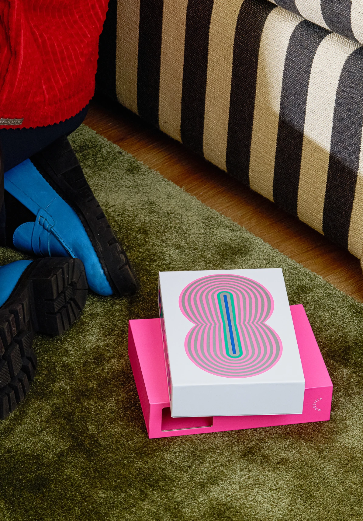
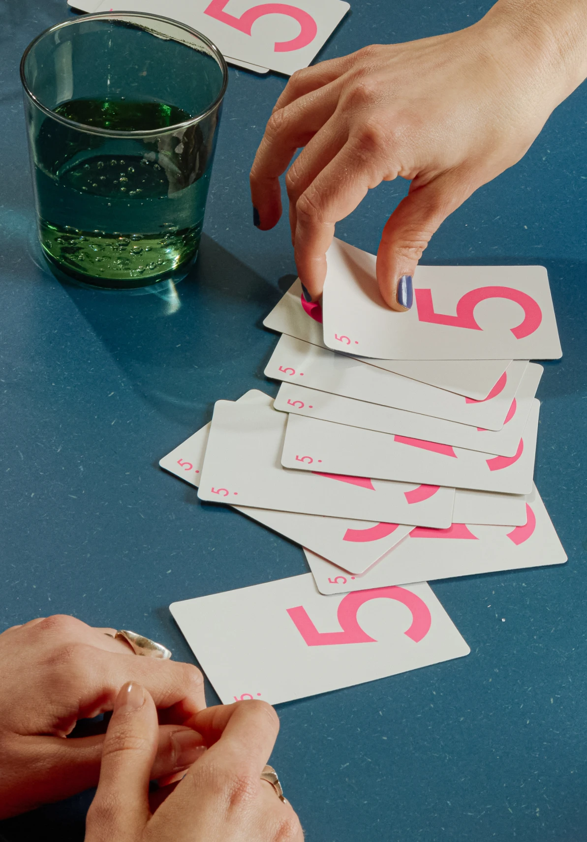
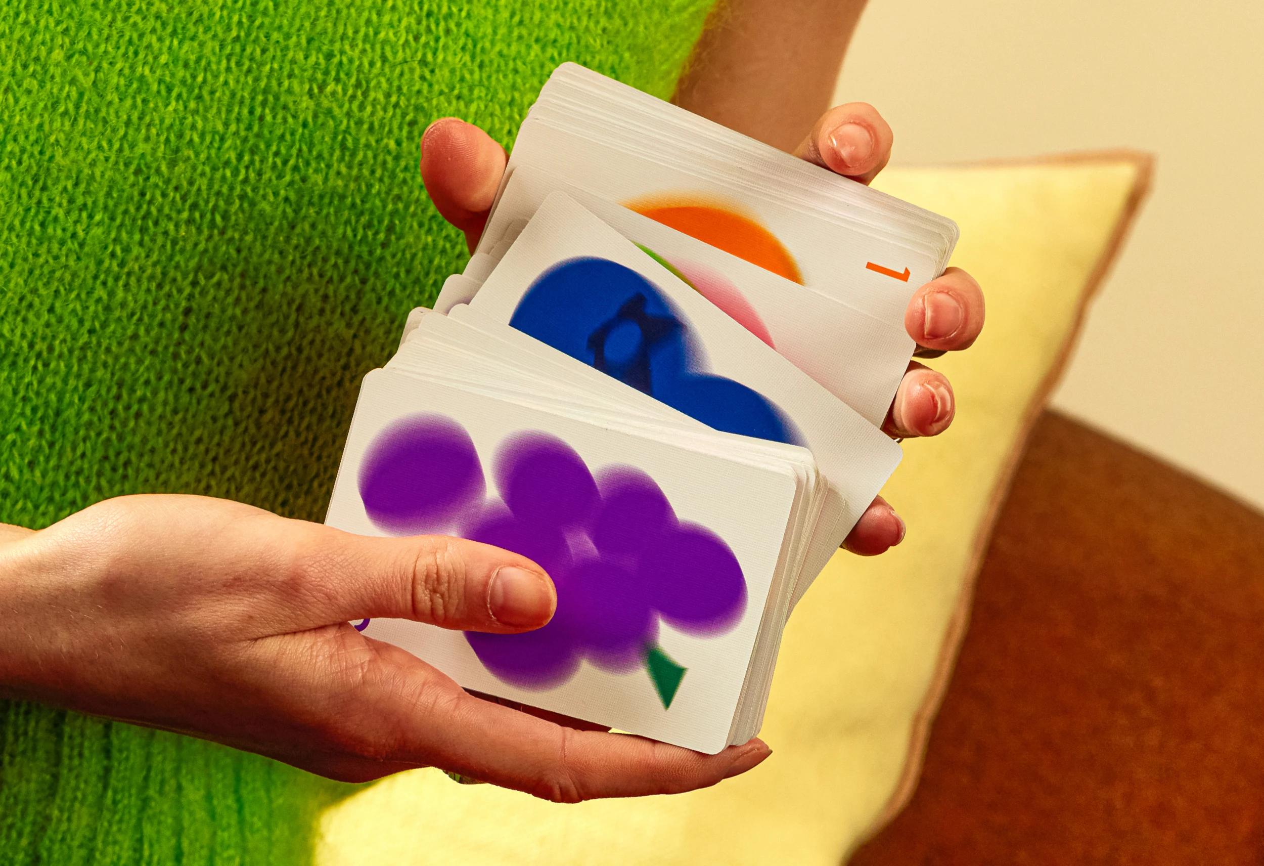
The photography art direction aims for a playful, relaxed vibe, highlighting the boldest, most colorful, and graphic aspects of Magenta’s brand identity.

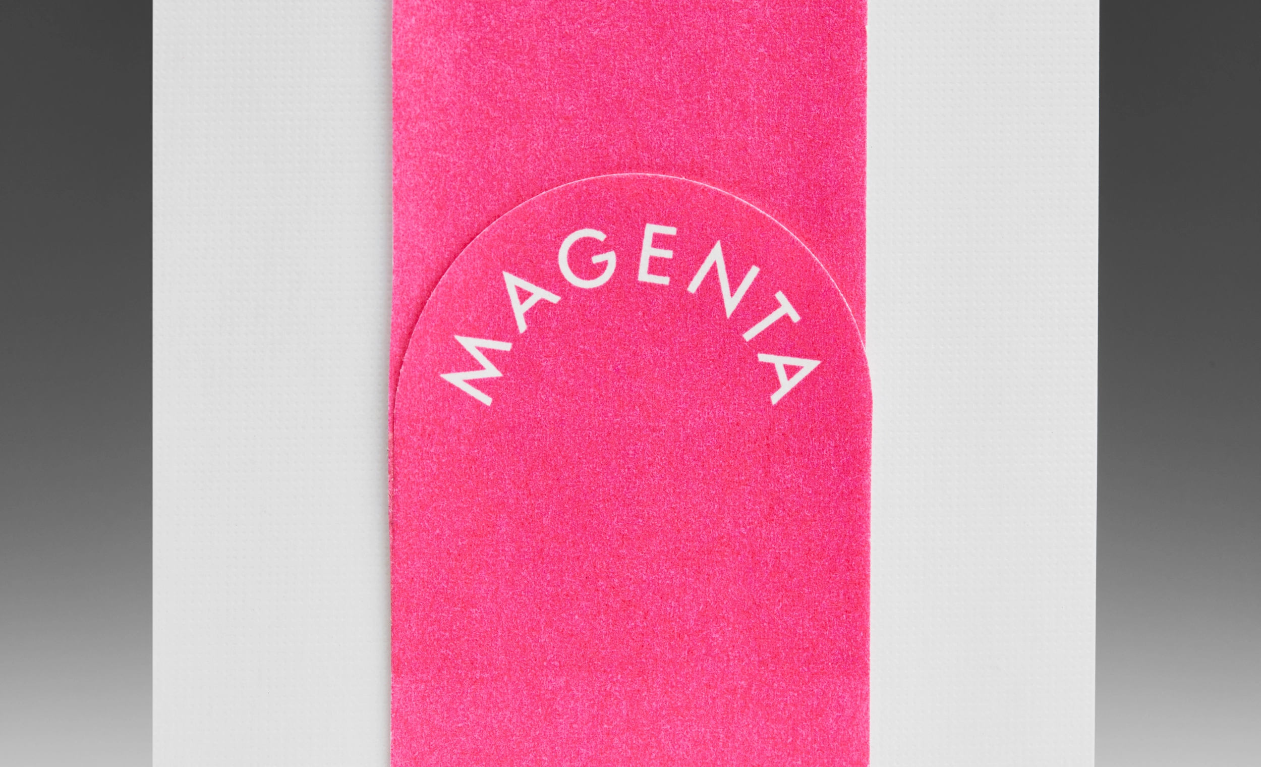
The brand language synthesizes what Magenta is in a simple, bold, and direct way. Similar to the packaging approach, its use can evoke a sense of curiosity and fun when its underlying meaning is discovered.
Photography Art Direction
SMLXL
Still Life Photography
Dani Forero
Duos Illustration
Guilherme Manzi
Motion Design
Dani Avila
Lifestyle Photography
Bre Furlong
Structural Packaging
Studio Mars
Identity and Packaging
in collaboration with
Principi