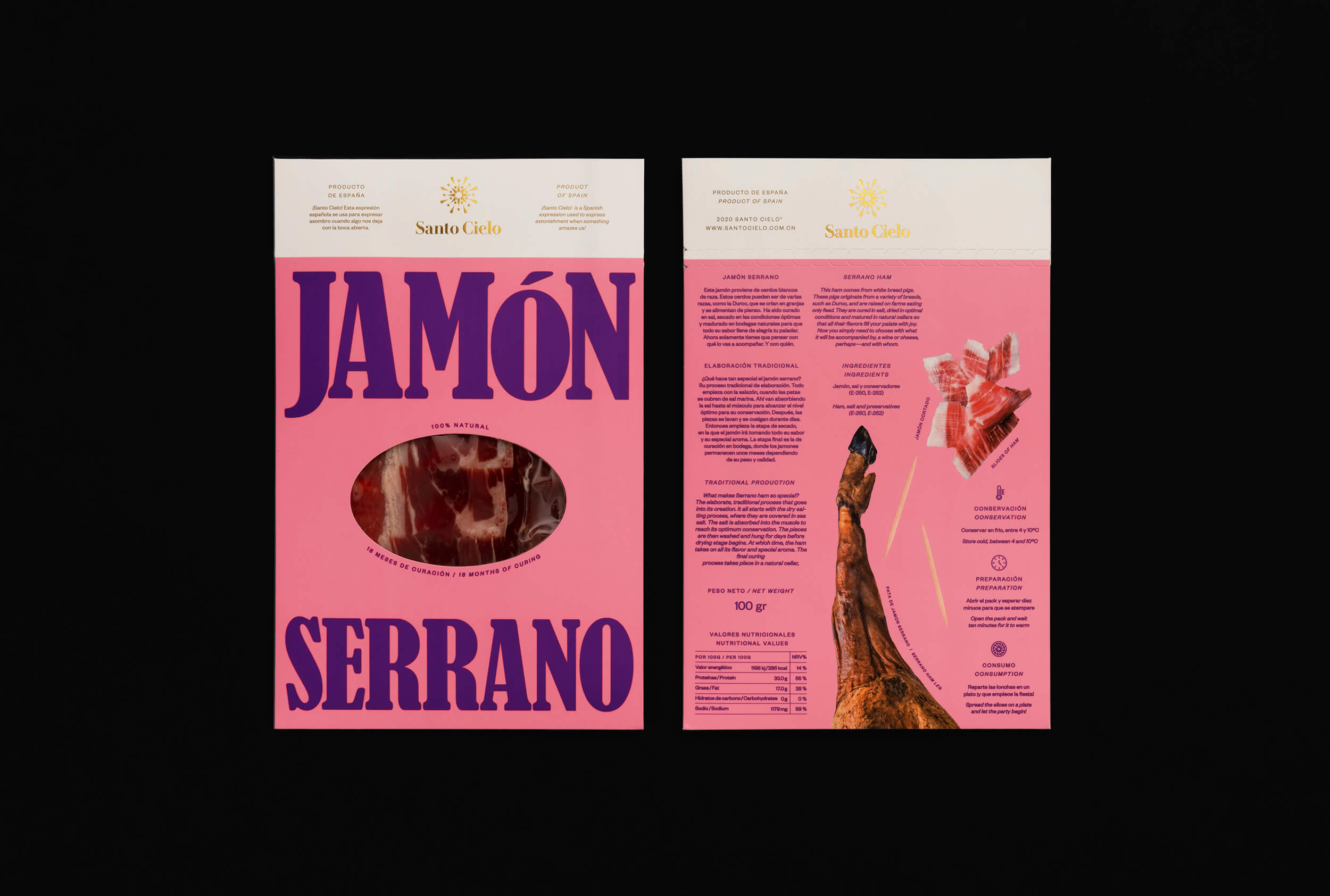
sANTO CIELO
Celebrating the character and vibrancy of Spanish cuisine
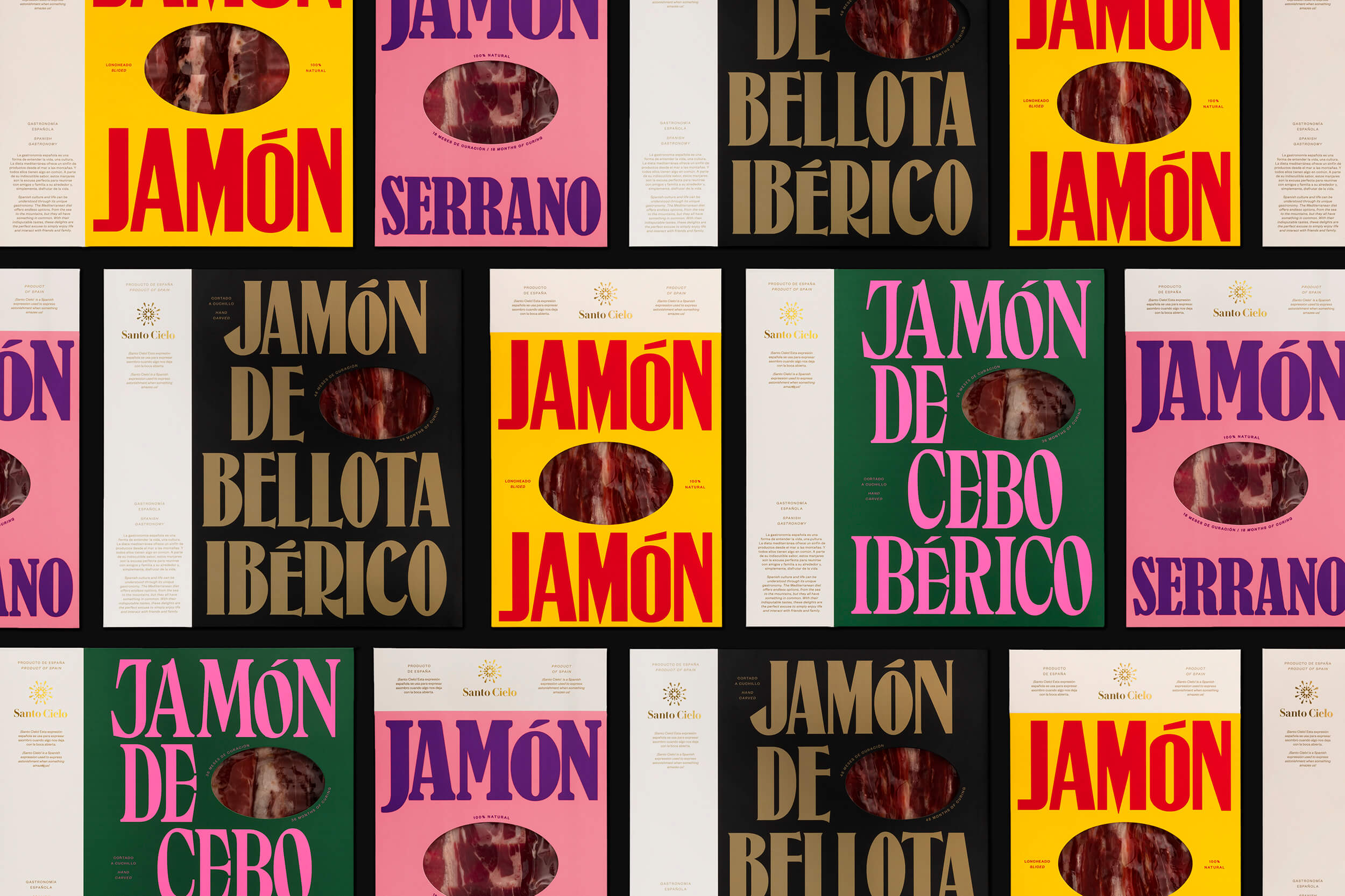
Visual Identity and packaging line for Santo Cielo, a Chinese delicatessen brand that imports traditional Spanish products into China. The project aims to celebrate Spain’s culture by capturing the vibrancy of its character.
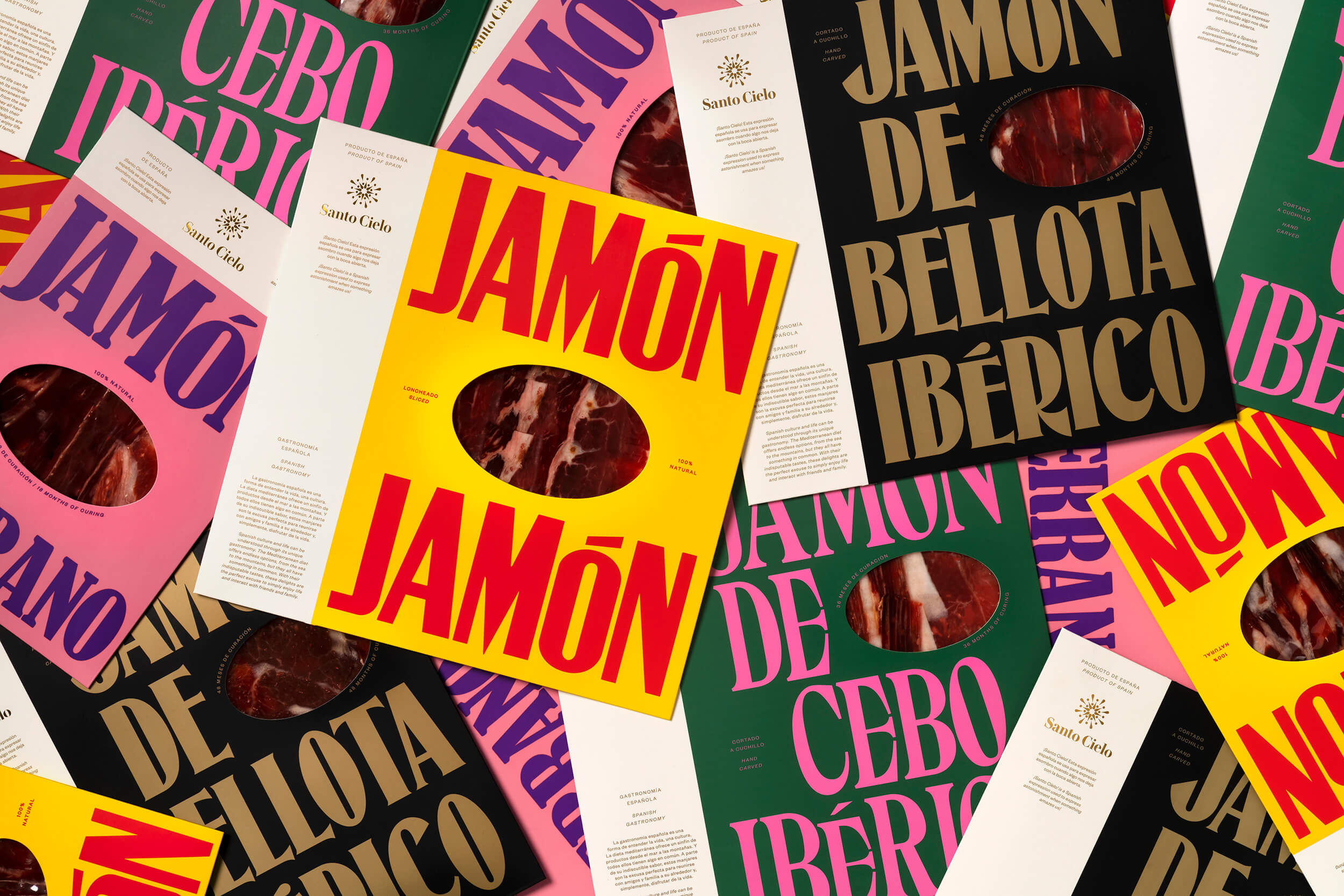
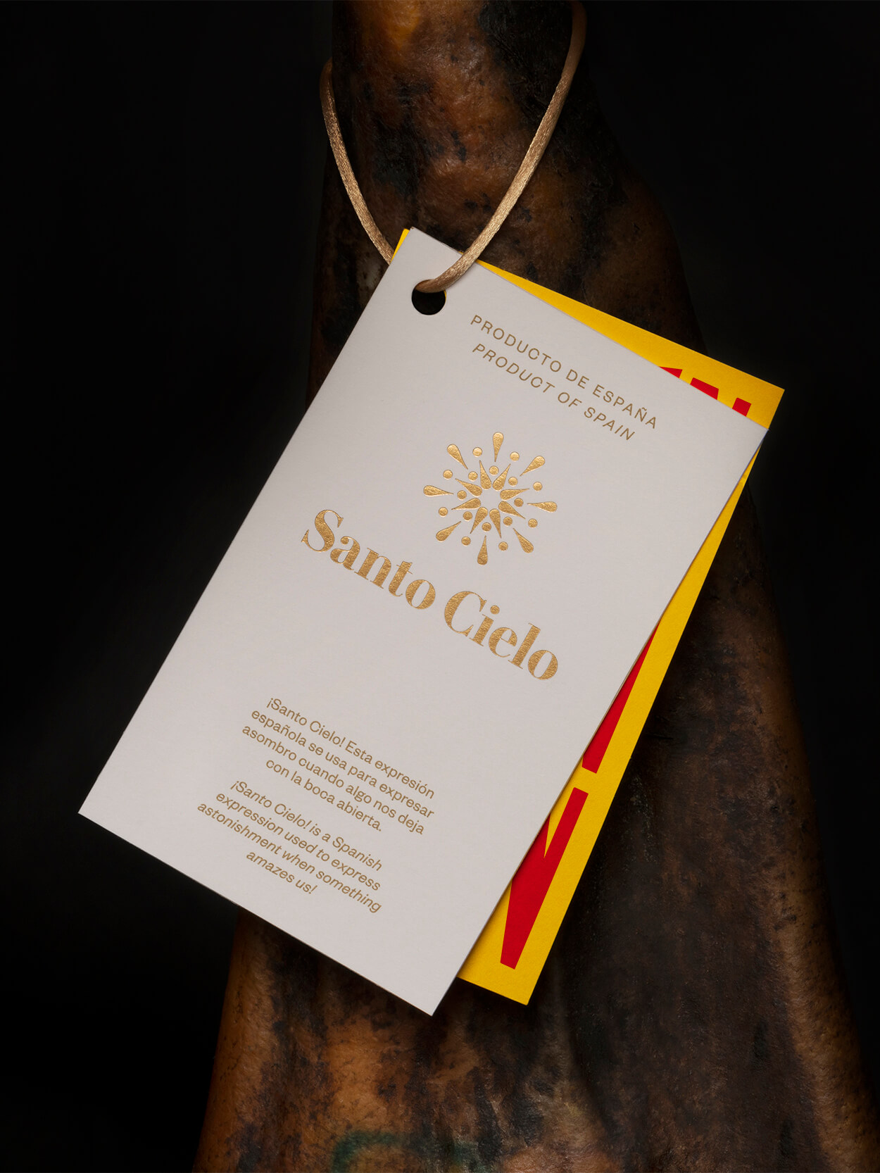
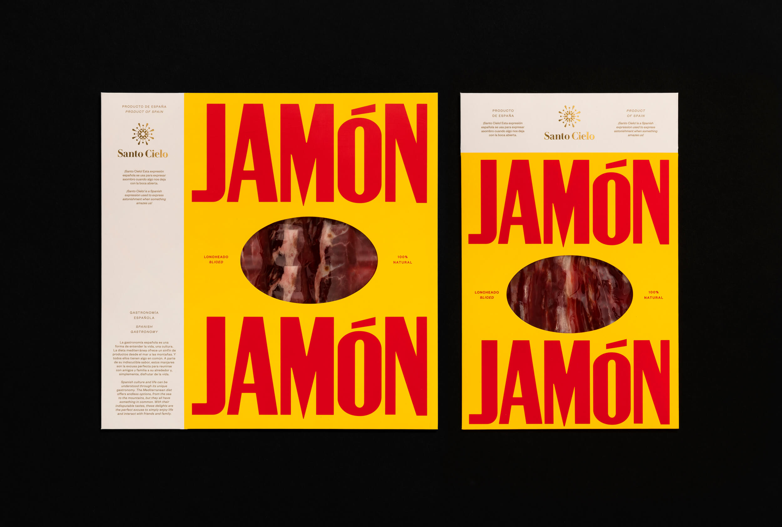
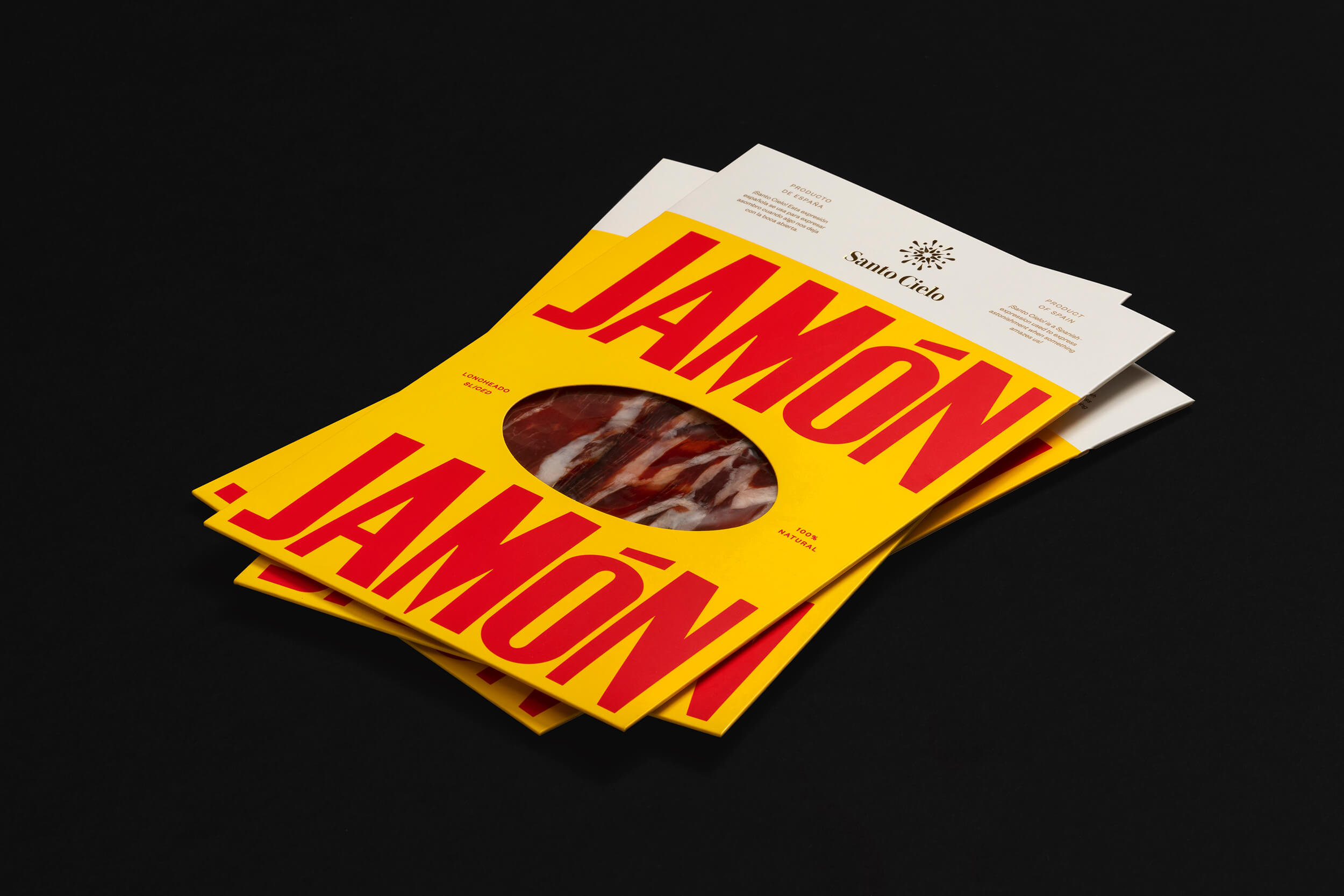
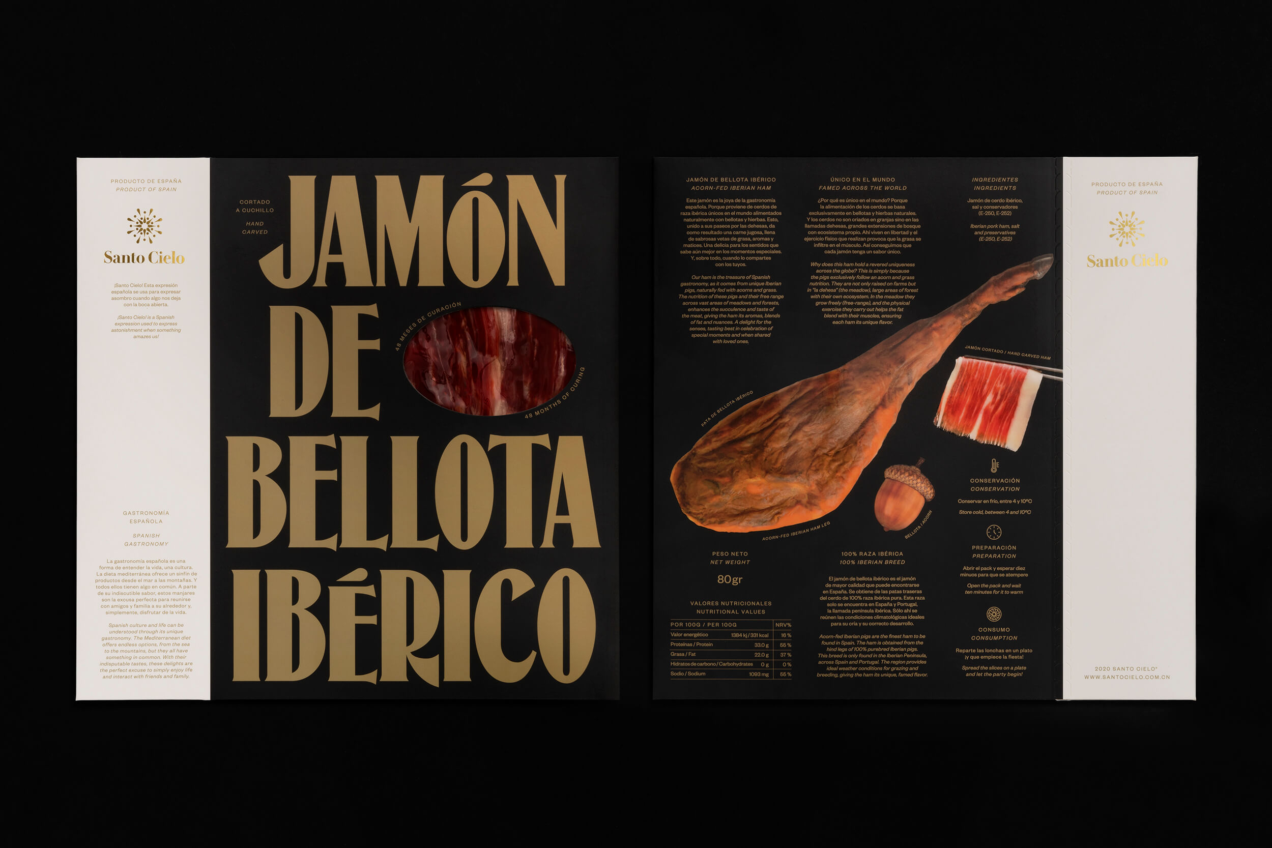
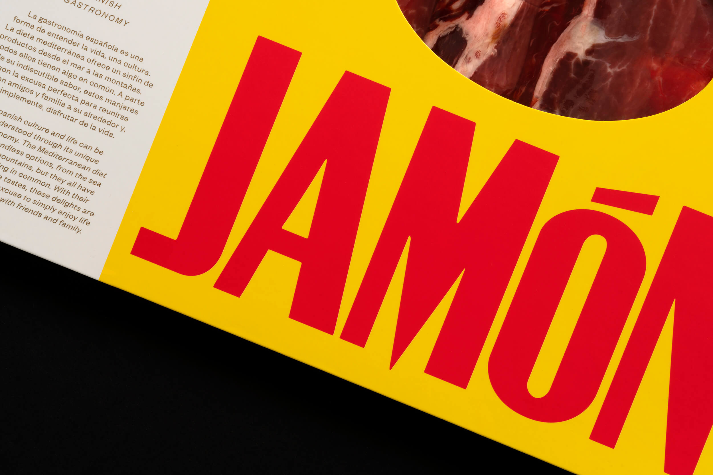
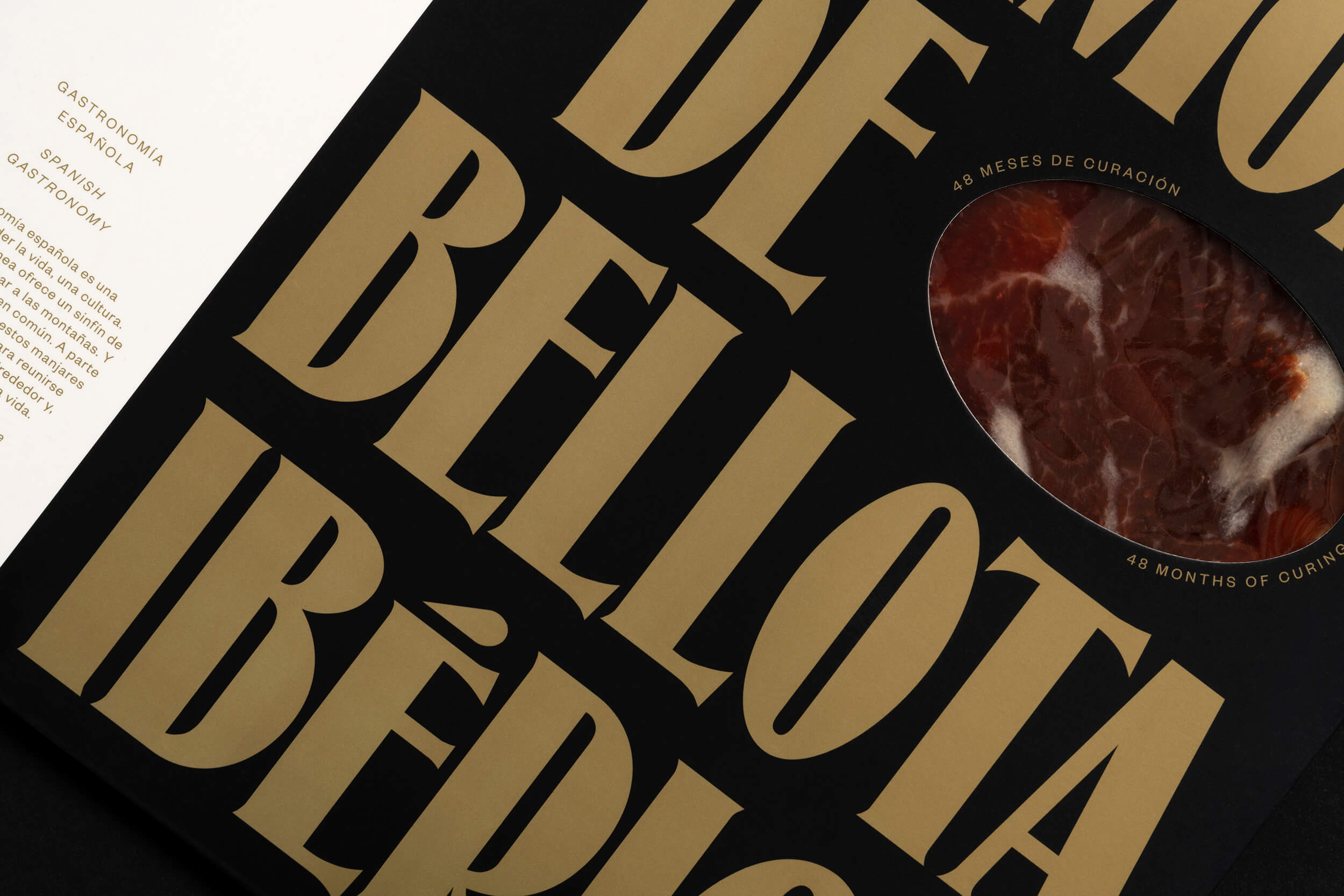
“¡Santo Cielo!” (similar to Oh My God! in English) is a Spanish expression used to show astonishment when something amazes us. The symbol is made out of exclamation marks to play with this idea, representing a holy halo.
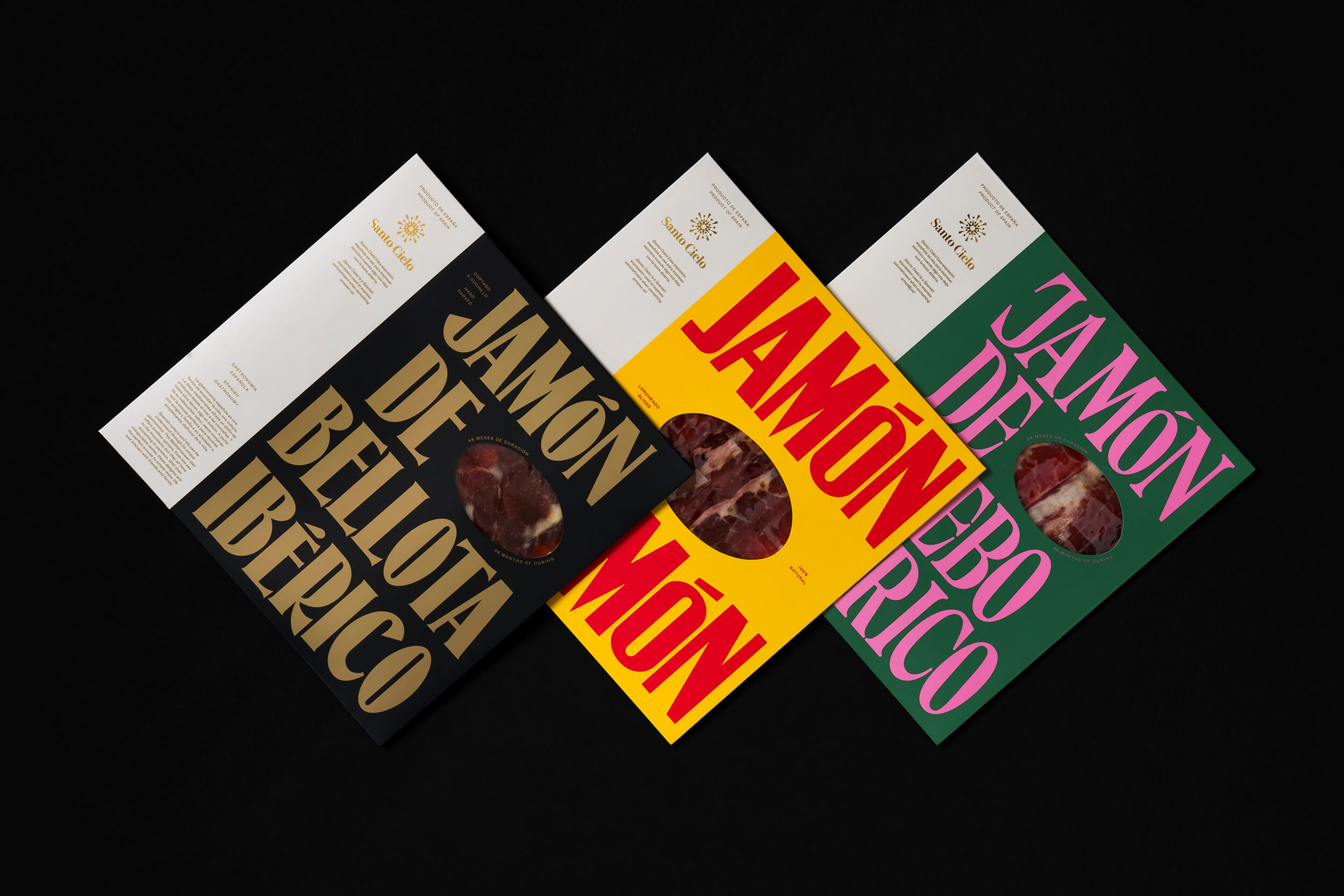
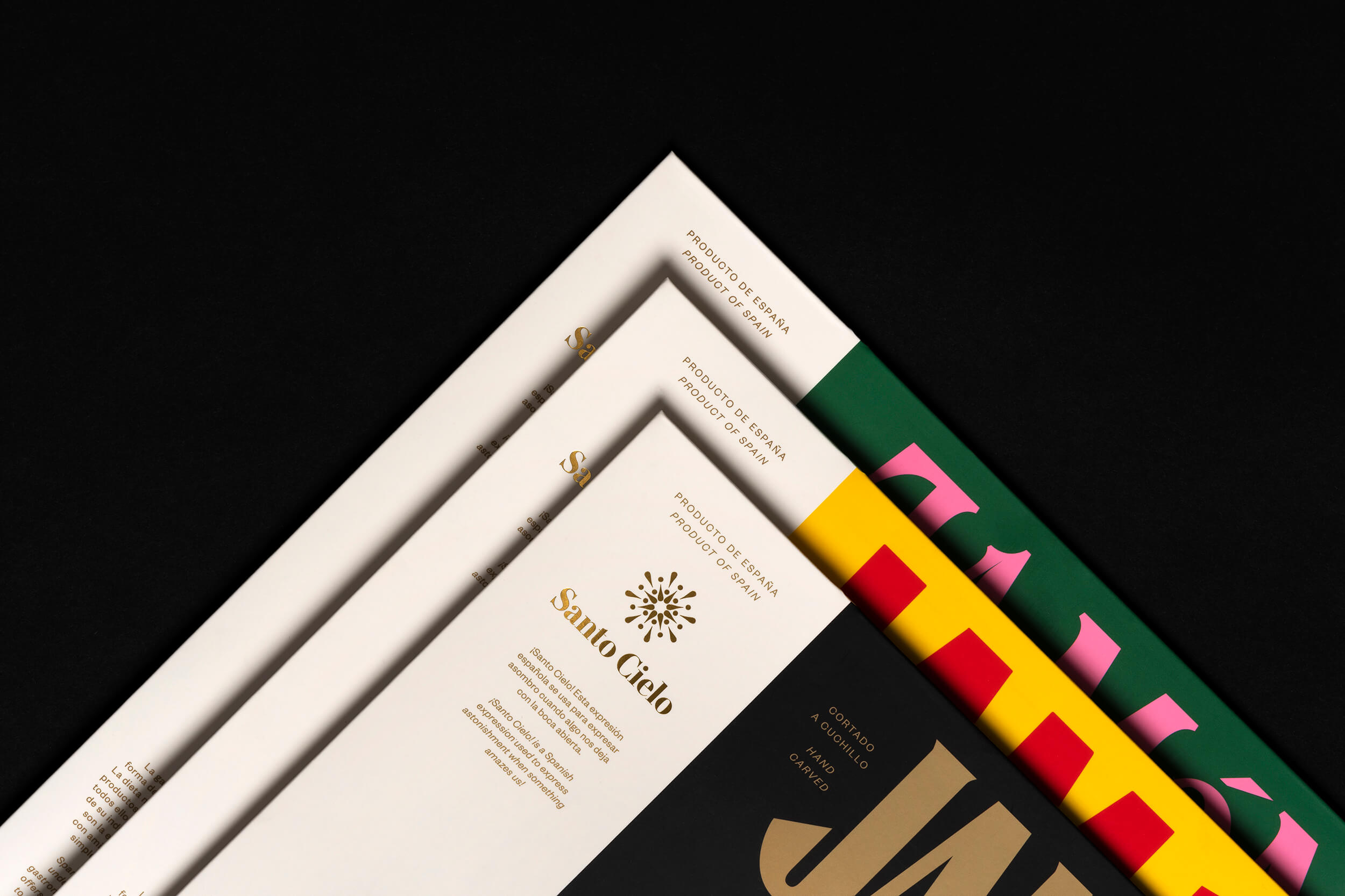
Coming from the nature of the naming, the packaging system is made out of two parts, one reserved to the sacred use of the brand, and the other used to reinforce the Spanish character through the diverse use of typefaces and colors.
Naming and Copy
Usted
Done as
Pràctica
Photography
Enric Badrinas