Visualizing risk through shape
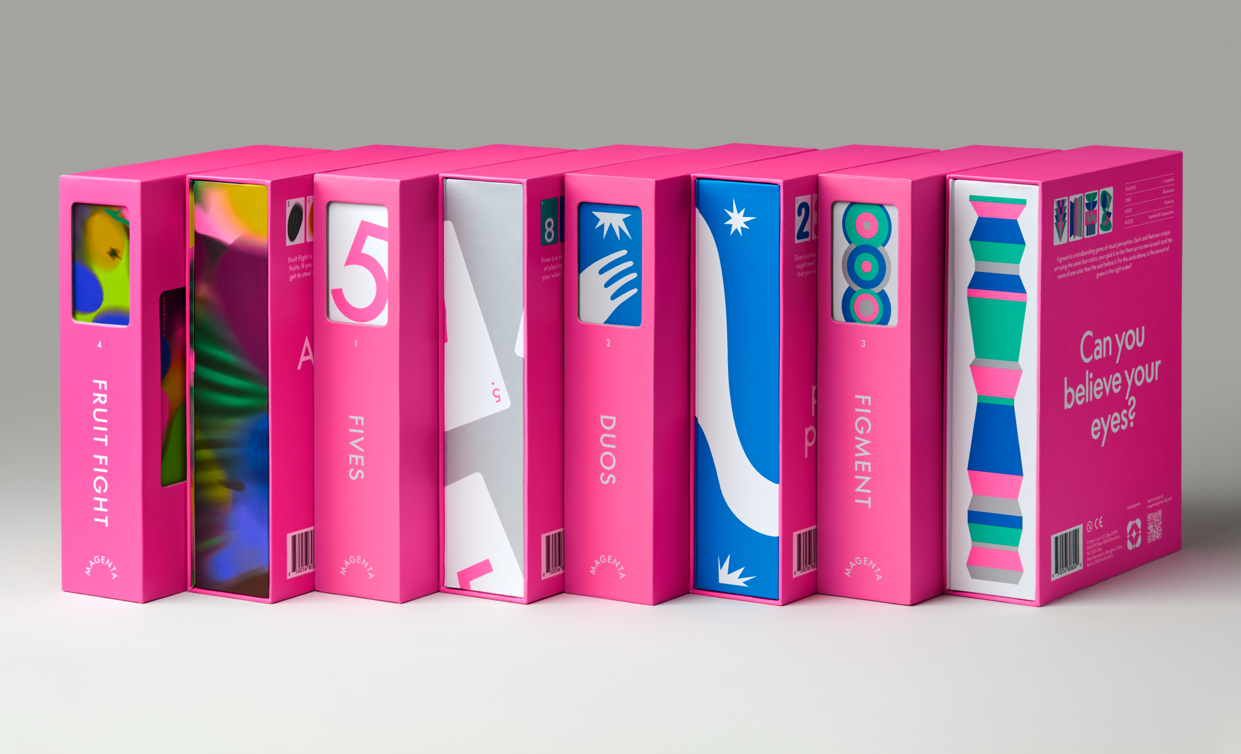
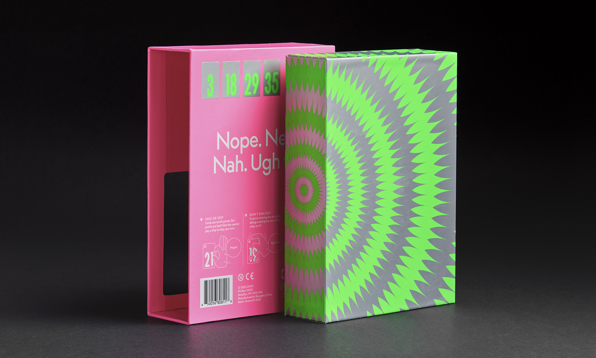
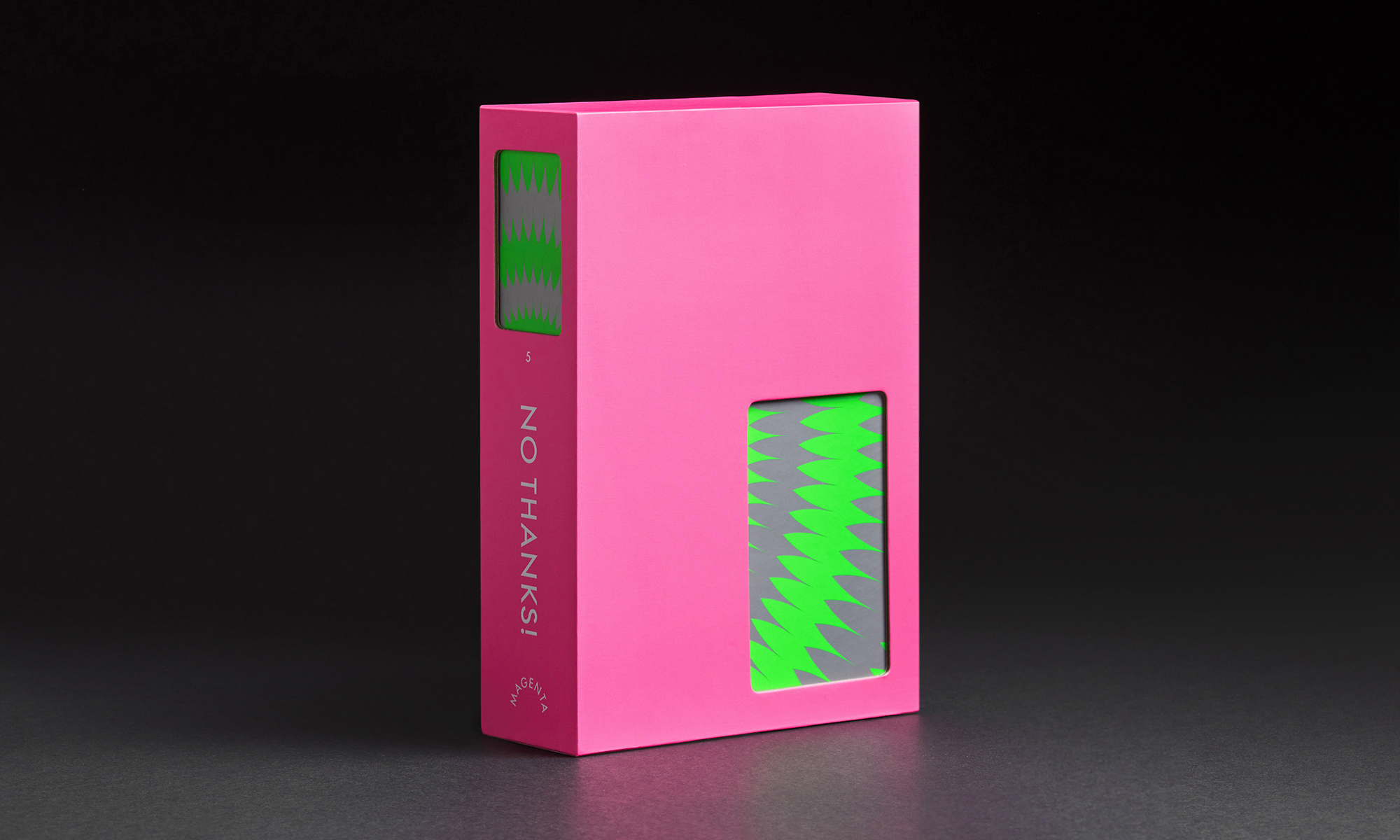
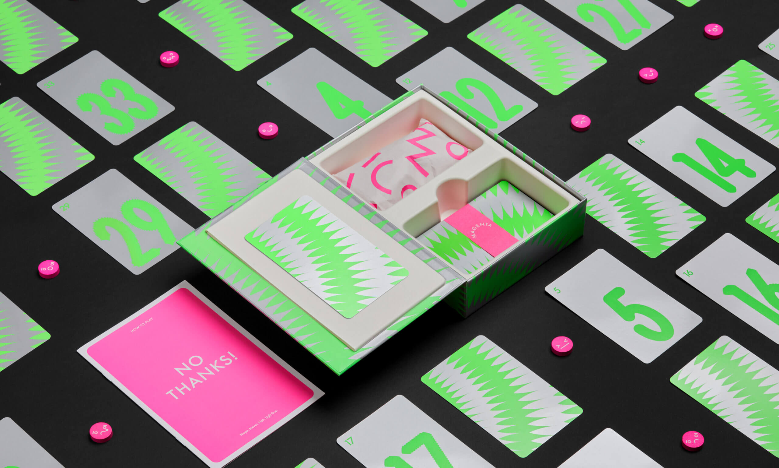
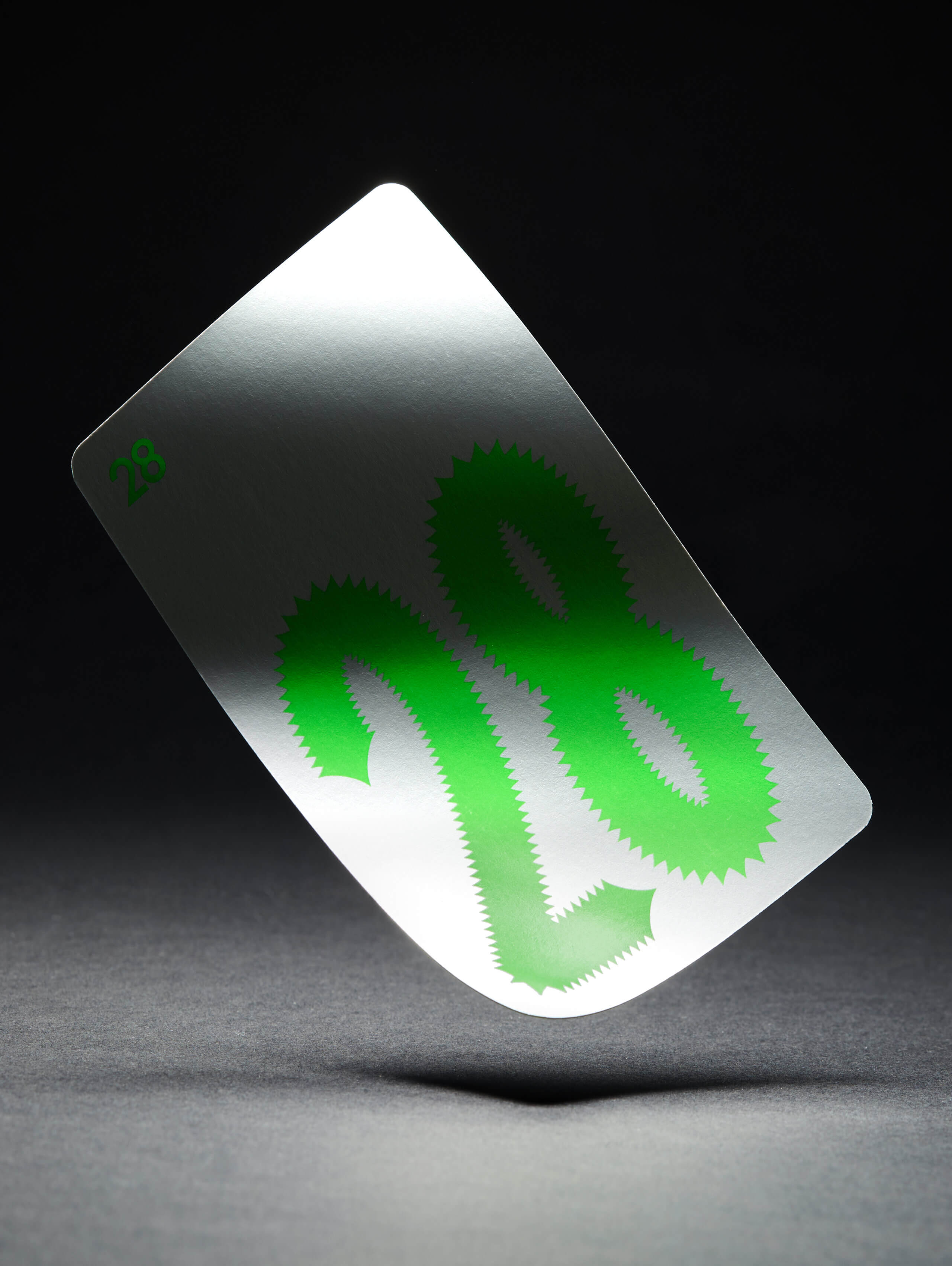
No Thanks! —the latest addition to the Magenta series— is a card game where cards are worth points, but points are bad. Ranging from 3 to 35, we designed a custom typeface that evolves with the risk: as the value of the card increments, the shapes shift from rounded and approachable to sharp and aggressive.
This design draws on the Bouba–Kiki phenomenon, where humans instinctively associate gentle sounds with friendly, rounded shapes, and harsh sounds with sharp, jagged shapes.
By applying this cross-sensory association, the typeface communicates the game’s tension at a glance. The sharper the number, the more it visually represents the “sting” of a high-value card.
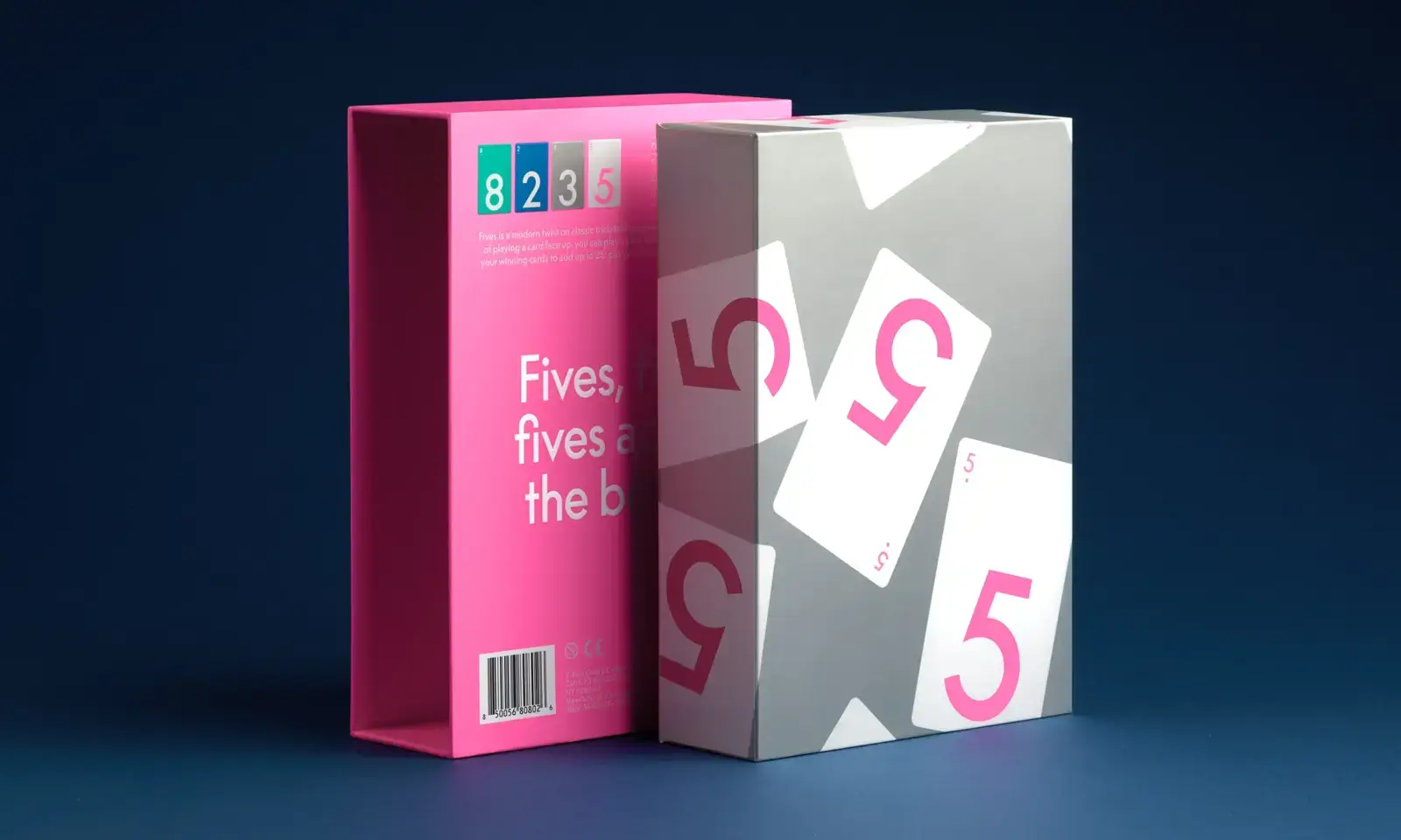
No Thanks! is made up of one suit, and each card has a single number from 1 to 35, allowing the numbers to be large and fill the space on the card.
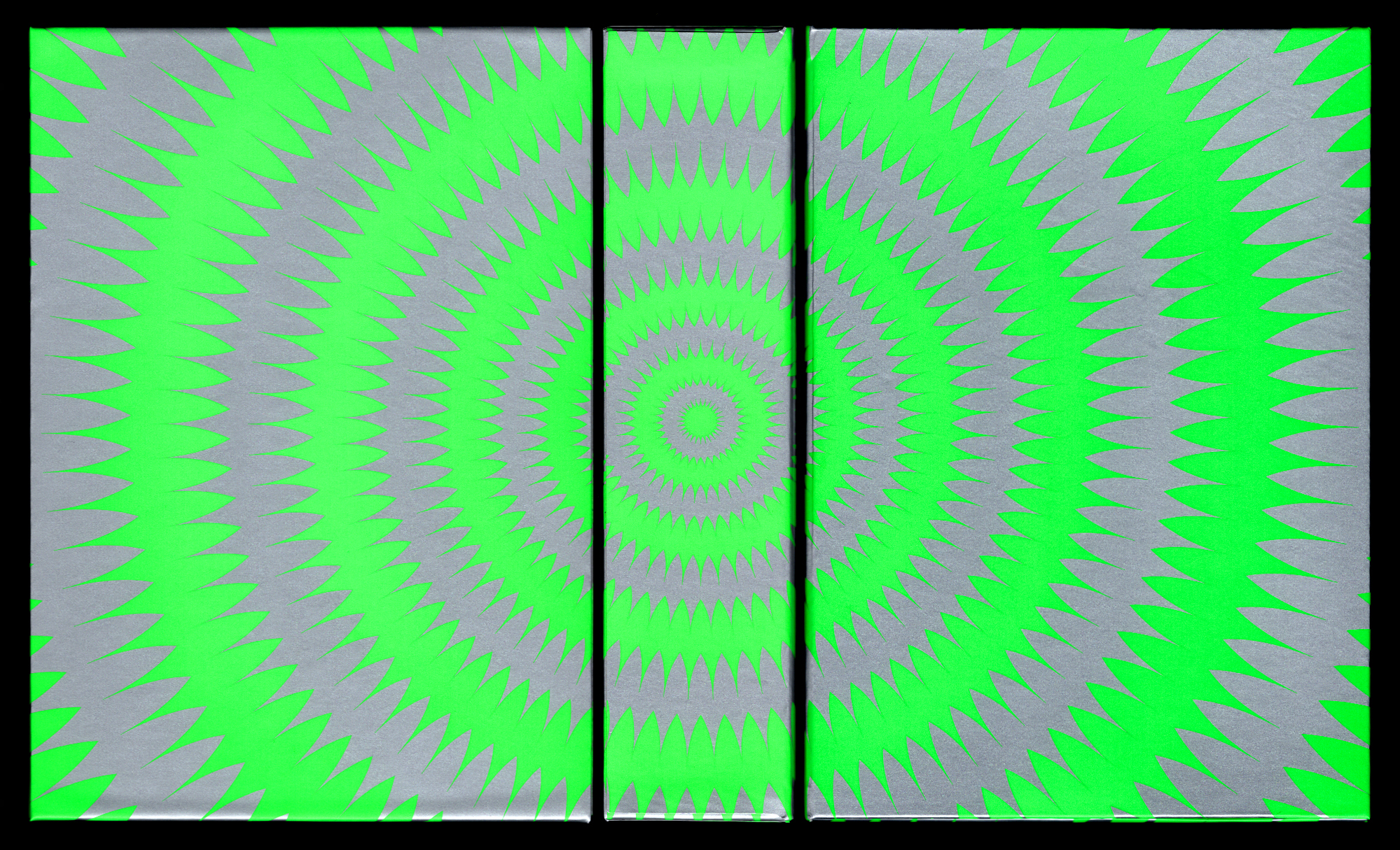
The cover illustration uses the same spiky effect as the typeface created, generating a cohesive language.
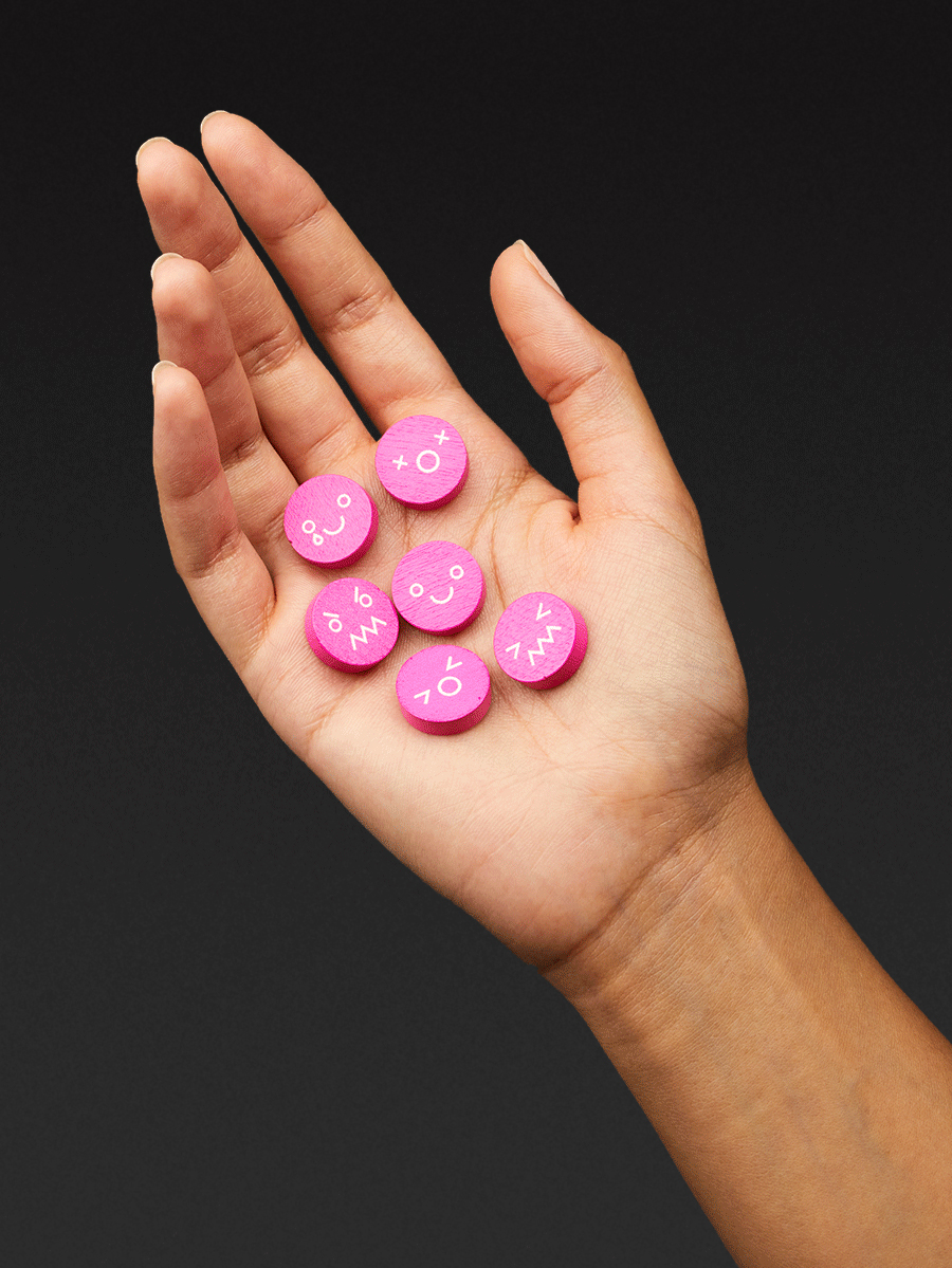
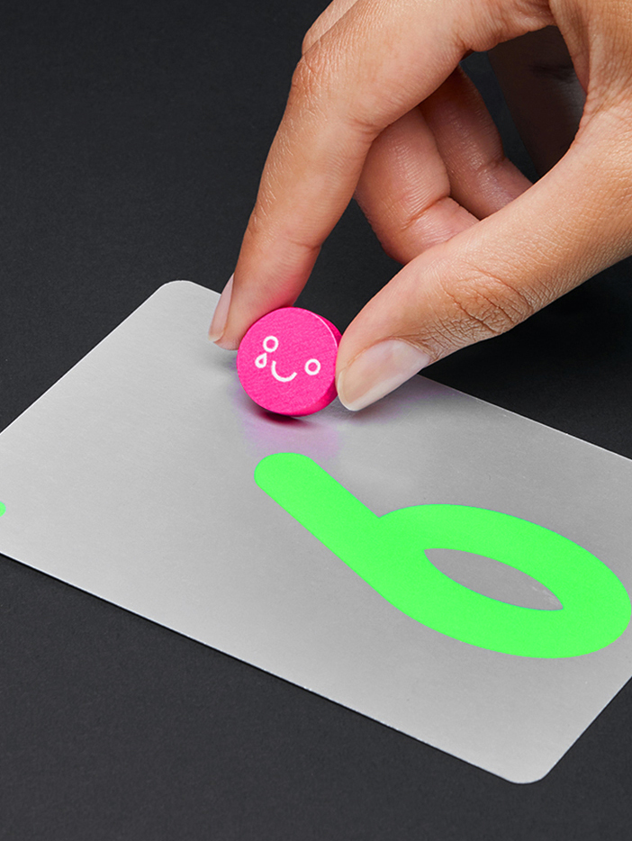
The design of the game tokens subtly reflects the range of emotions you might experience while playing—joy in winning, frustration in losing, and even disappointment in missing out.
CMYK
Gaming & Play
Visual Identity
Packaging
Art Direction
Type Design
SMLXL
Anna Berbiela
Javier Arizu
Guillem Casasus
Lakis Sobyra
Dani Forero