Rethinking a Cannabis Brand to stand out in a saturated market
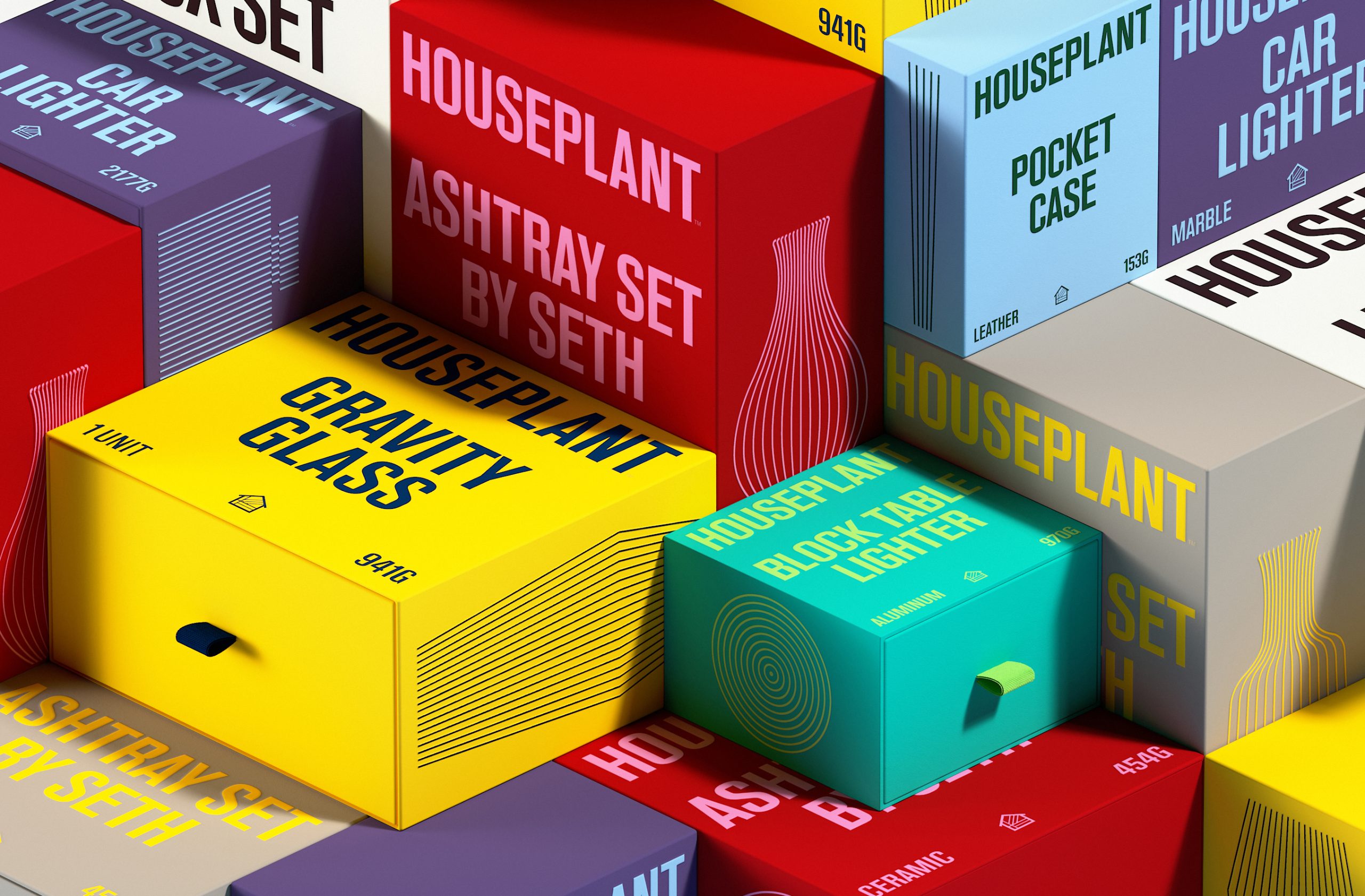
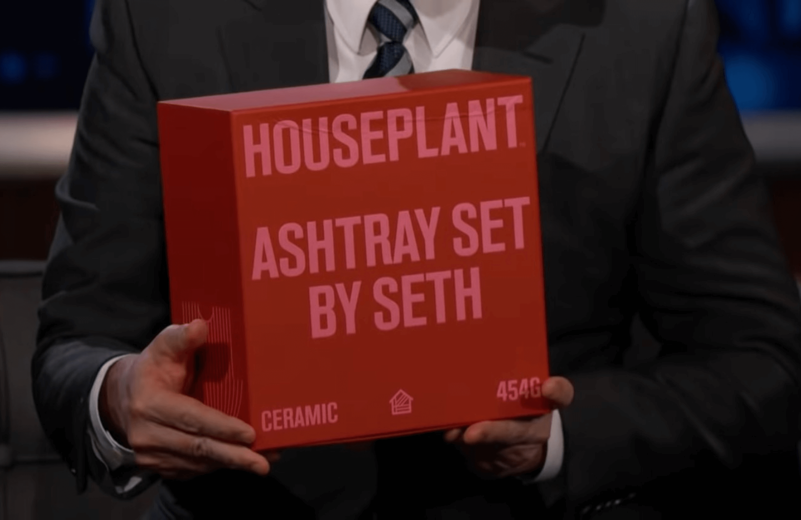
Packaging redesign for Houseplant; a cannabis brand founded by Seth Rogen for its launch into the U.S. market (originally from Canada). Taking Houseplant’s existing logotype and symbol as the starting point, we developed a typographic and illustration system that helped unify and revamp the brand’s wide new range of products and overall communications.
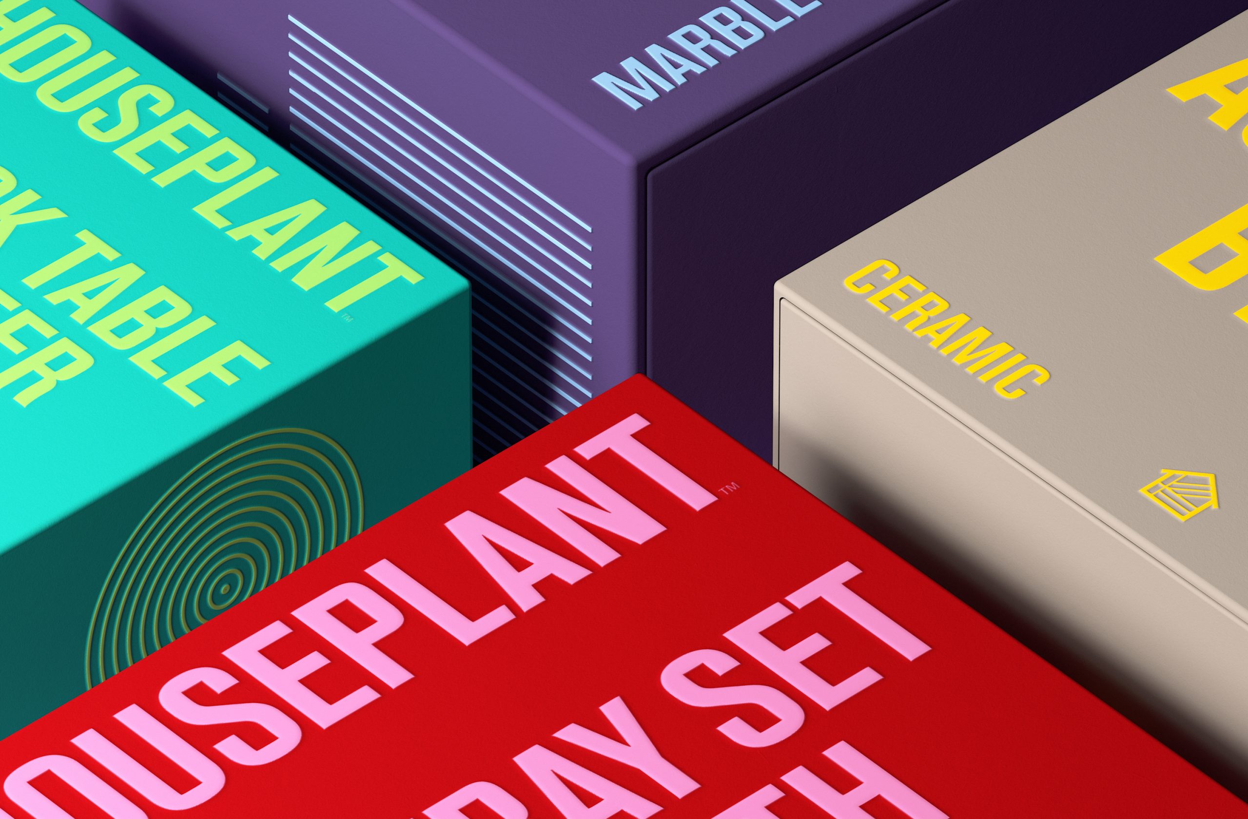
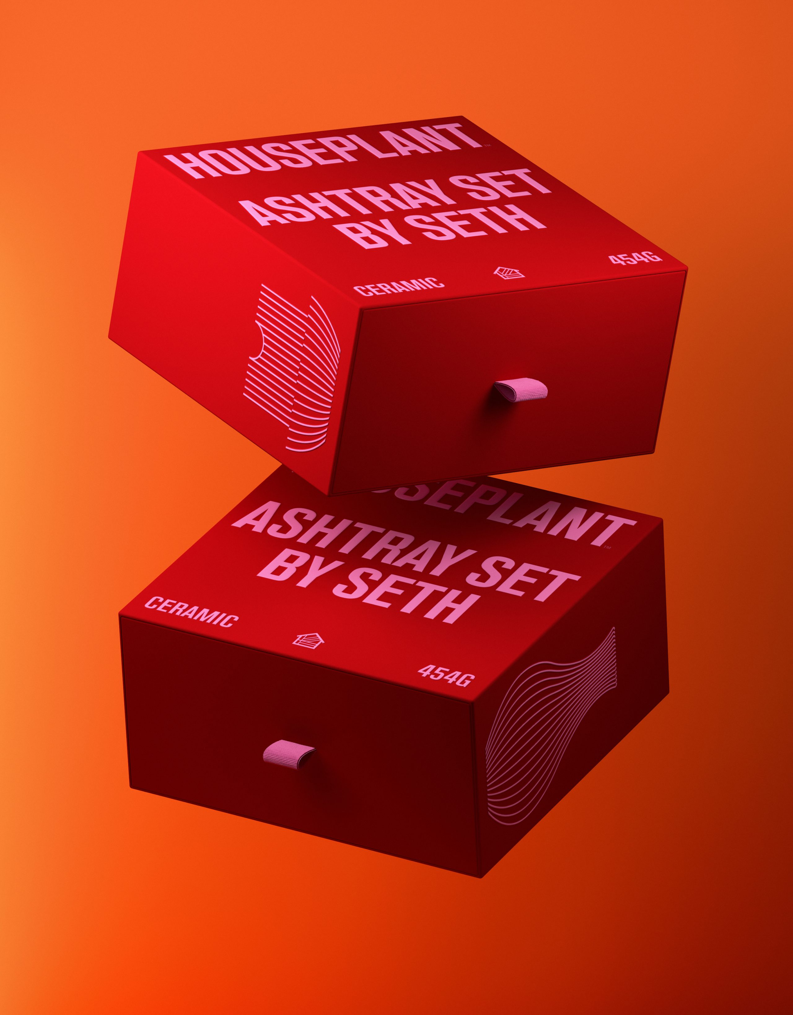
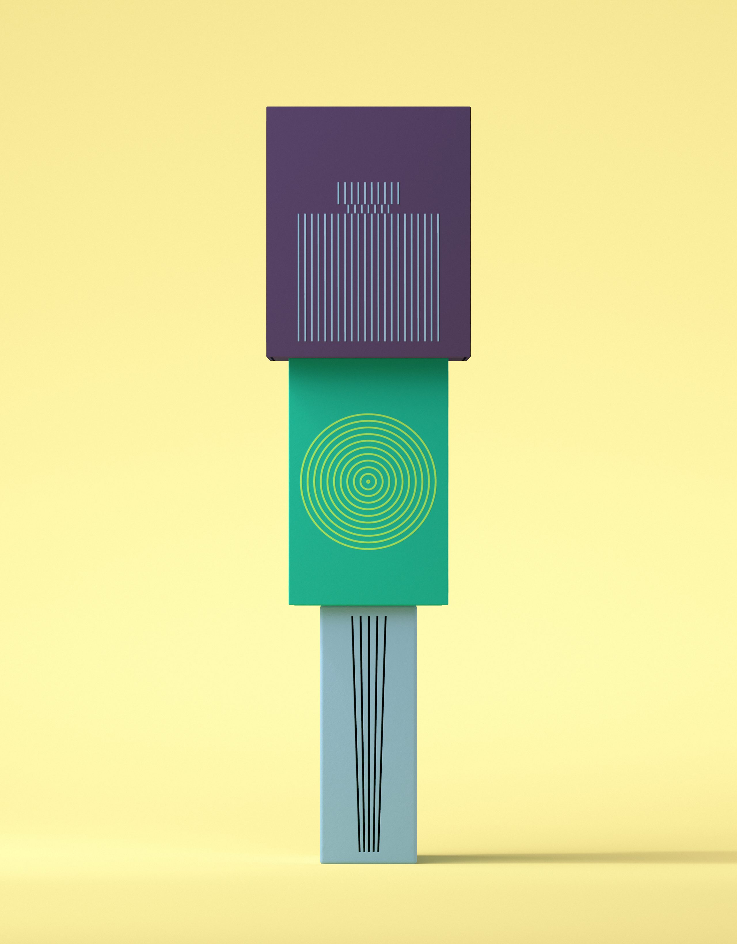
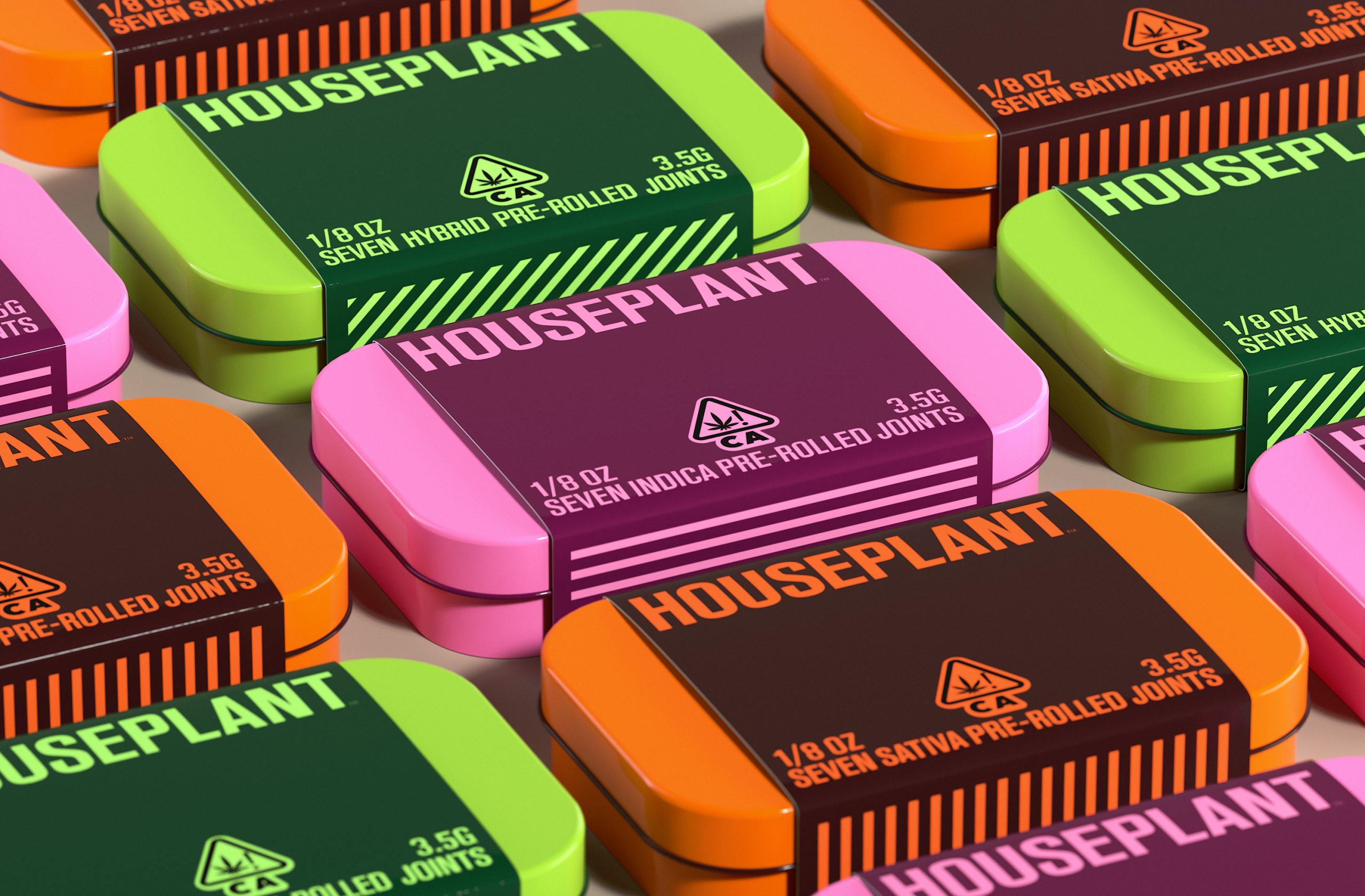
The redesign includes the introduction of a wider typographic system with a custom typeface based on the original logotype; a unifying line illustration system that helps represent the forms of the products packaged within; and a fresher color palette with brighter hues to convey the vibrancy of the company.
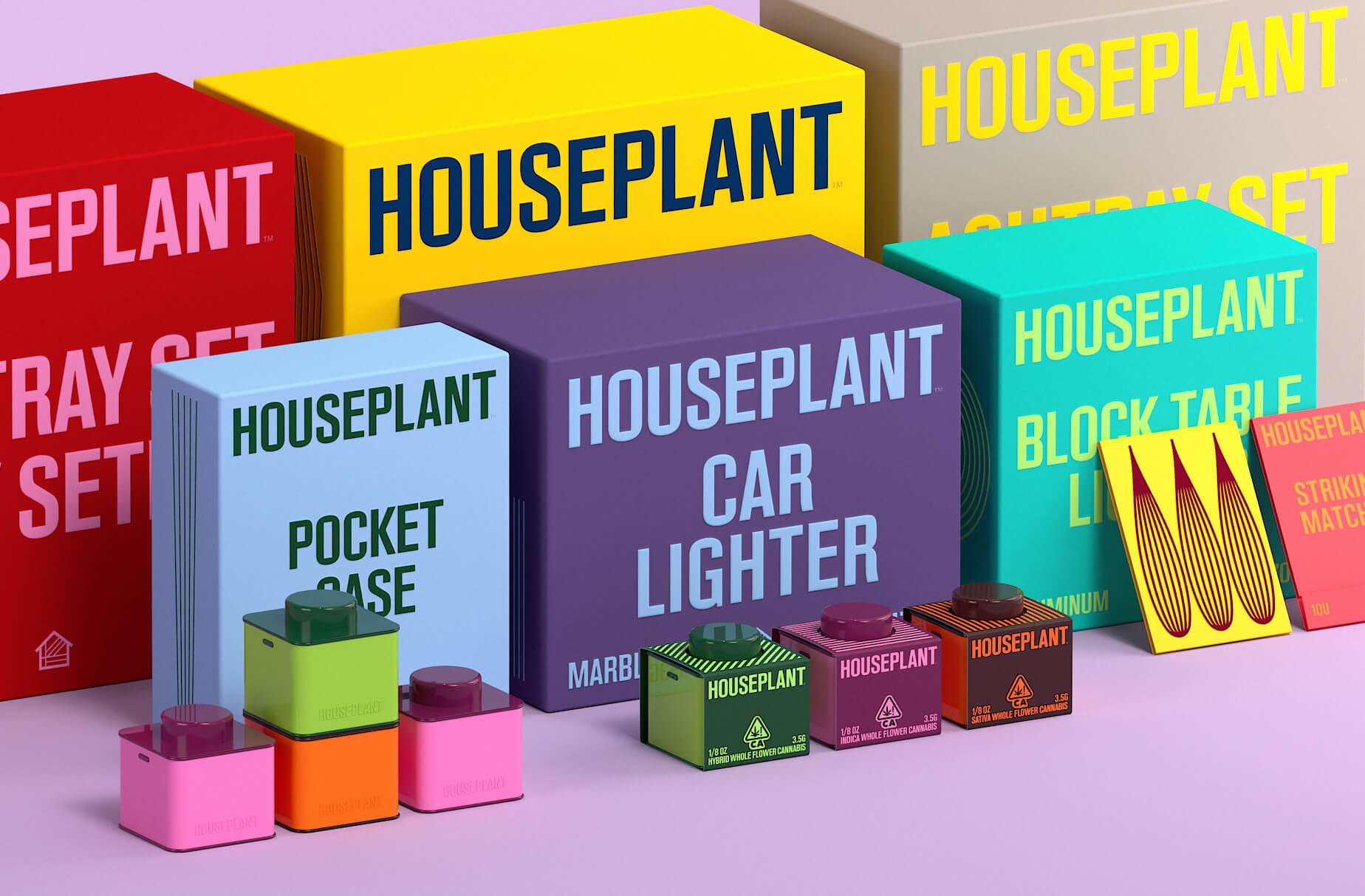


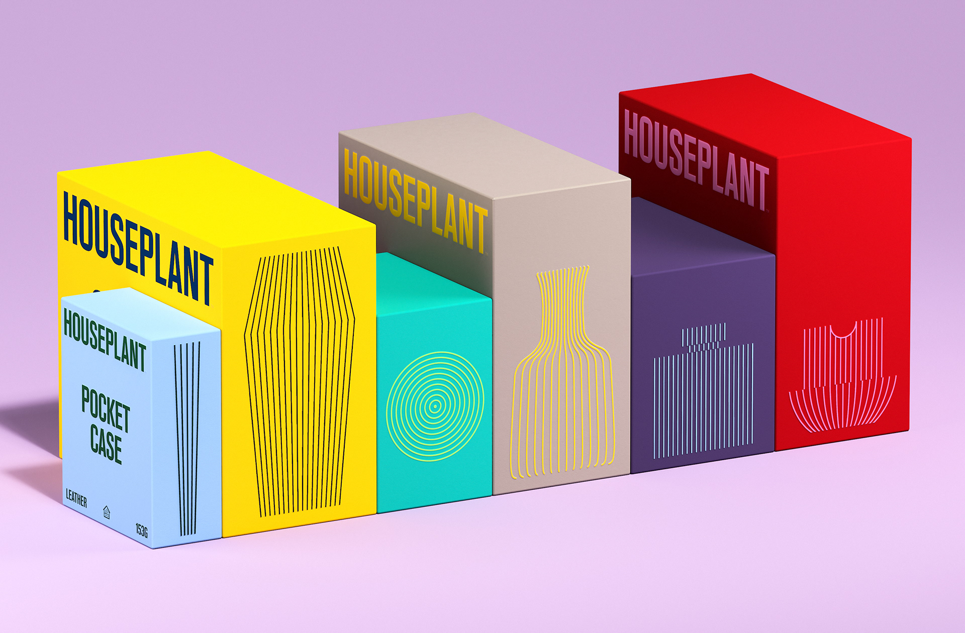
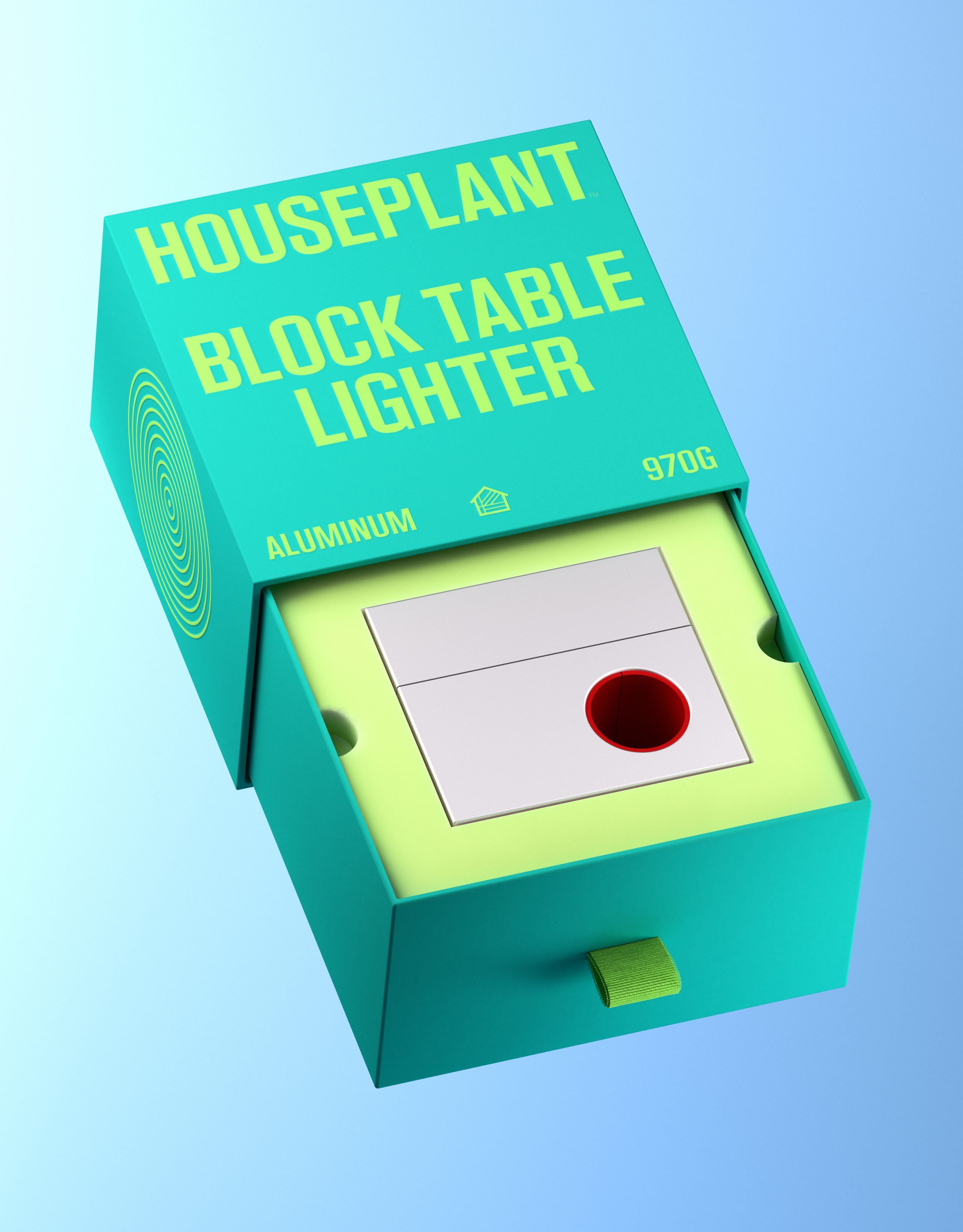
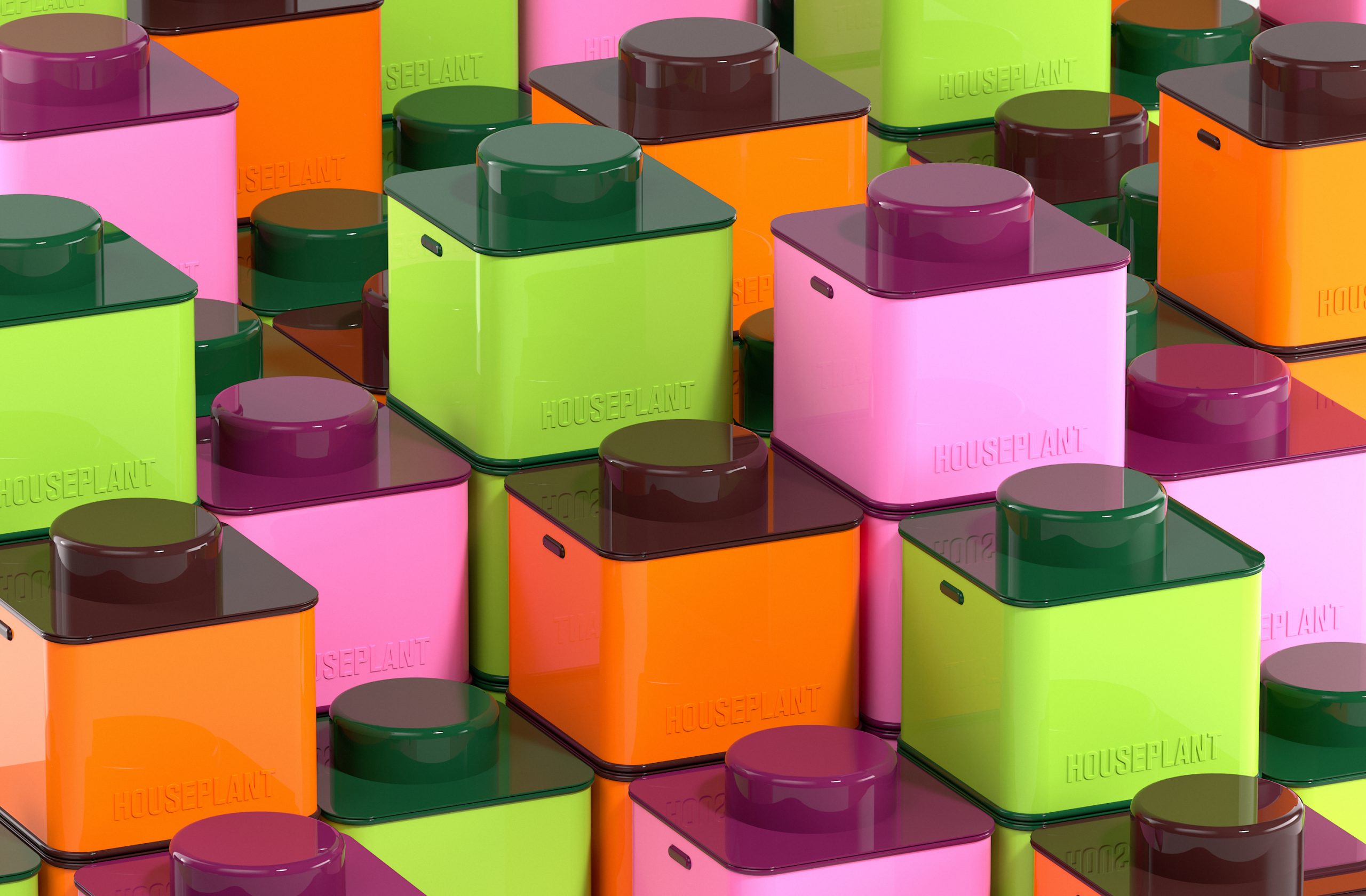
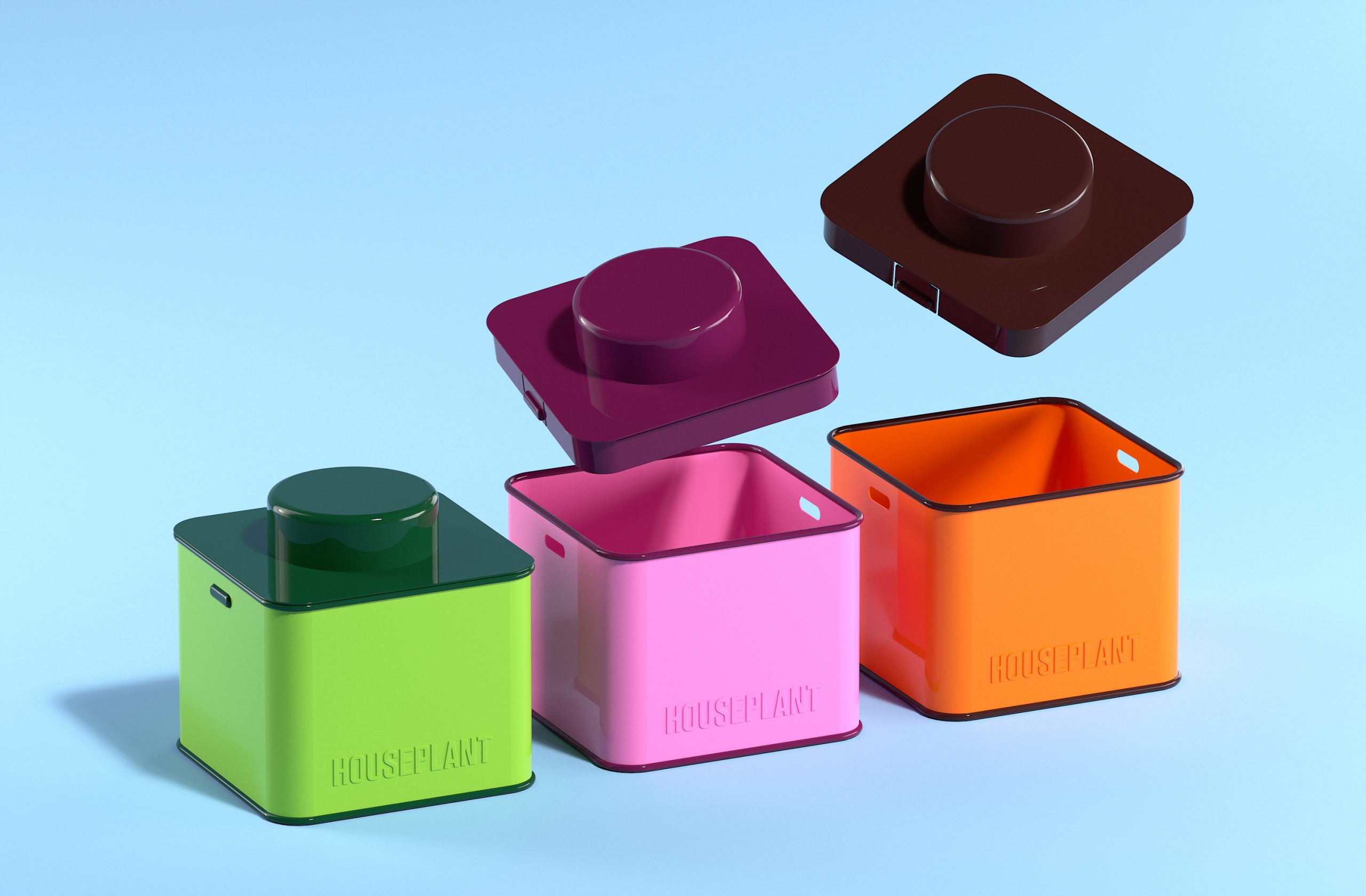
The structural packaging maintains a simple design; a solid colored drawer system, in which the complimenting color is featured within the typography, line illustration, pull tab, and eco-foam within.
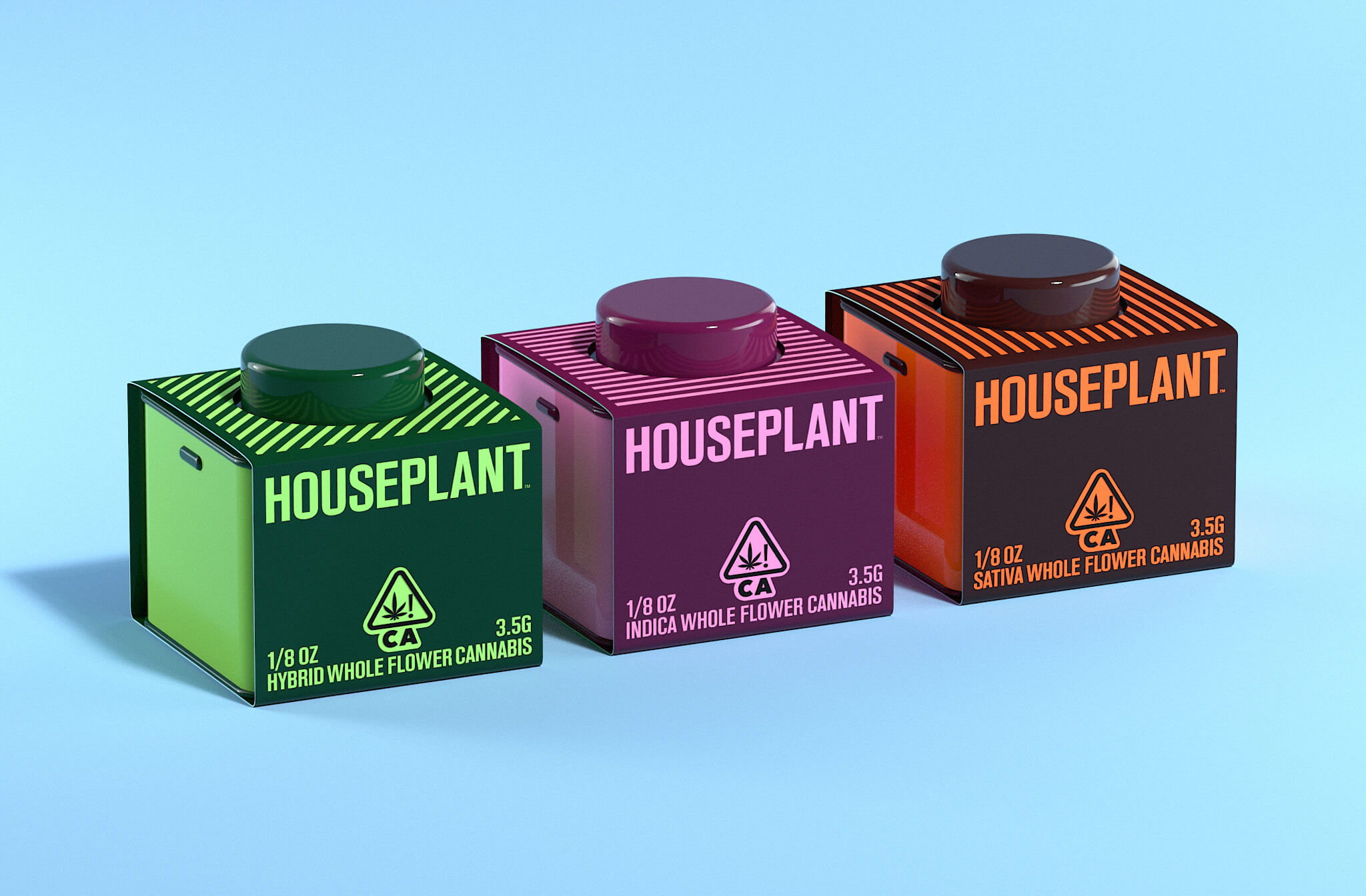
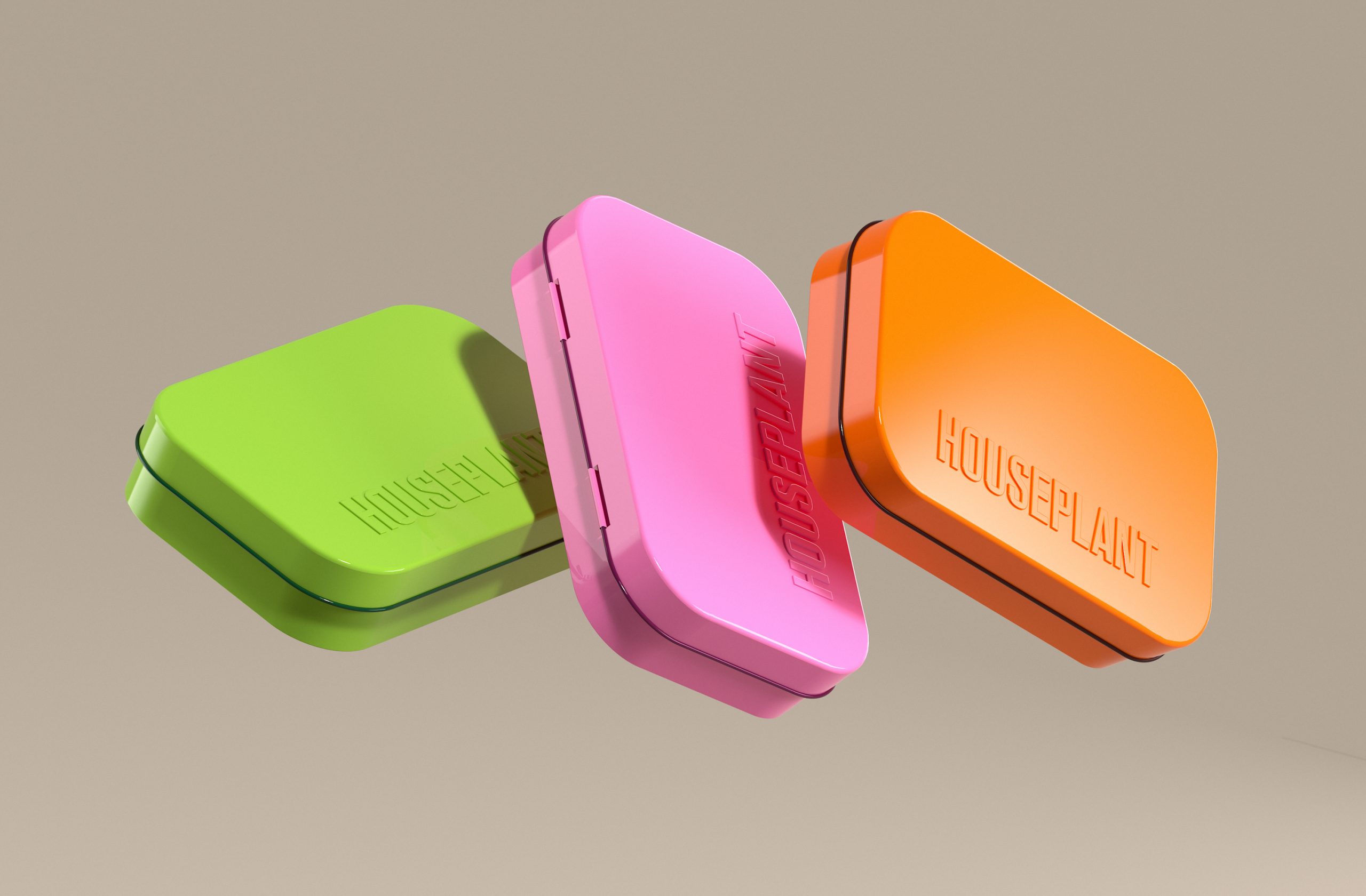
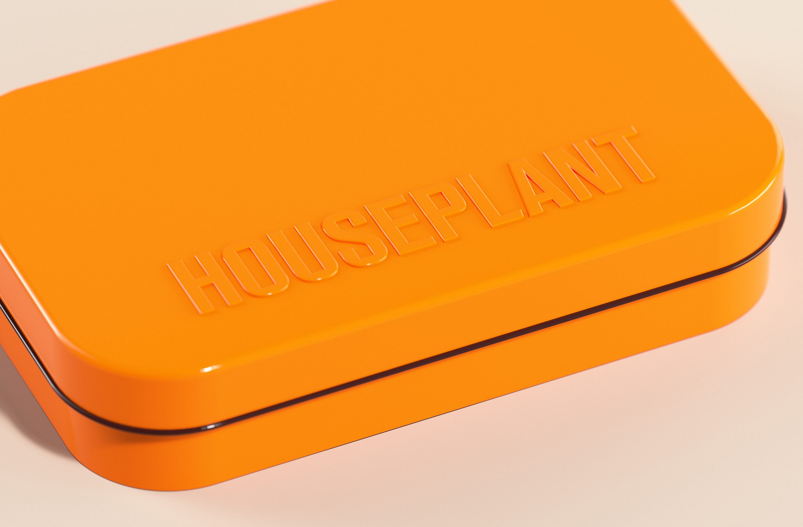
In line with the company’s goal to be more sustainable, we also designed a series of recyclable tin ‘jars’ to house the cannabis goods, as well as, tin cases for pre-roll joints.
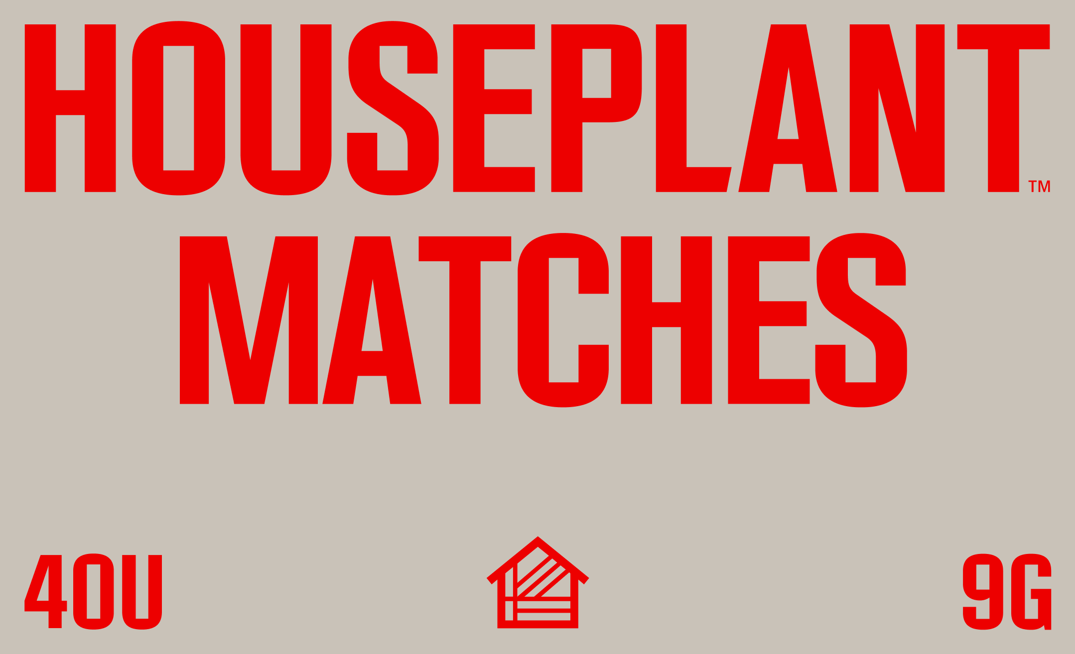
In efforts to keep the packaging as sustainable and with as little waste as possible, we designed a simple label wrap for the tins made out of cardstock paper with printed graphics.
Identity and Packaging System Design done as
Pràctica
Structural Packaging Design and Product Design
MA-MA
Typeface Production
Tipografies
Animations and 3D renders
Dani Avila